How to Convert App Visitors Into Installs: 10 Proven Tactics for 2026
We drove 40,000 clicks to our app in three days and converted 1,900 of them. Here is exactly what we changed to fix that, and why it works.
Cyrus

Traffic is not the problem.
I learned that the expensive way, on a habit-tracking app I worked on two years ago. We had done everything right on paper. App Store ads were live. A TikTok creator had just posted a video that pulled in 40,000 clicks in three days. Our analytics dashboard showed a steady stream of visitors landing on our store page every hour. The team was celebrating in our Slack channel.
Then I pulled the install numbers. Out of those 40,000 clicks, we had converted 1,900 installs. A 4.75% conversion rate. For a productivity app, where the category benchmark sits closer to 65%, that was not a good month. That was a leak so large it made the traffic almost irrelevant.
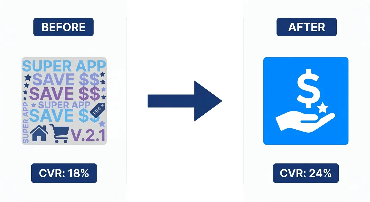
It took me a full week of staring at our store listing to understand why. Our icon was a soft gradient blob that looked elegant in Figma and disappeared into the background next to every competitor's bold, high-contrast icon. Our first screenshot was a splash screen with our logo and tagline. Nobody scrolled past it to see the app actually working. We were paying to bring people to the door and then closing it in their faces before they could see what was inside.
In 2026, the average app store page converts between 26% and 33% of visitors into installs (Storemaven / AppTweak benchmarks). That means roughly two out of every three people who find your app walk away without downloading it. If your conversion rate sits below that average, and ours certainly did that month, you are leaving a compounding amount of revenue on the table every single day.
The math matters more in 2026 than it ever has. iOS cost per install averaged $5.84 in Q1 2026, up 19% year over year (Digital Applied, 2026). Every visitor who does not convert is paid acquisition budget that evaporates. But here is the other side, the one that turned our habit-tracking app around: fixing conversion is essentially free. The same traffic, better conversion, more installs, lower effective CPI. It is the highest-leverage lever available to any app team right now. We proved that out over the following six weeks, and I will walk through exactly what we changed and what it did to our numbers.
This guide covers 10 specific, actionable tactics to convert more of your existing visitors into installs in 2026. Each one is grounded in current data. Each one is implementable without a developer on most platforms. And where it is useful, I will tell you what actually happened when we applied it, not just what the benchmark says should happen.
The 2026 Conversion Landscape: What the Numbers Say
Before tactics, context. These are the benchmarks that define what good looks like in 2026.
Metric | 2026 Benchmark | Source |
|---|---|---|
Average iOS page view to install CVR | 25% (US, all categories) | AppTweak 2026 |
Average Google Play CVR | 27.3% | AppTweak 2026 |
Business app CVR benchmark | 65%+ | Adapty 2026 |
Gaming app CVR benchmark | 3 to 5% | Adapty 2026 |
Tap-through-to-install on iOS | 33.4% | Digital Applied / AppTweak 2026 |
Tap-through-to-install on Google Play | 27.7% | Digital Applied / AppTweak 2026 |
CVR uplift from improved icon | Up to +30% | SplitMetrics / Kirro 2026 |
CVR uplift from first 2 screenshots | Up to +21.7% | SplitMetrics 2026 |
CVR uplift: rating improved 3.6 to 4.2 | ~60% higher CVR | AppTweak 2026 |
CVR uplift from Custom Product Pages (iOS) | Up to +8.6% | AppTweak / Apple 2026 |
CVR from preview video | +20 to 35% | DEV.to / AppTweak 2026 |
Typical web-to-app conversion rate | 2 to 5% of web visitors | Botsi / Adjust 2026 |
Apps using Custom Product Pages (CPPs) | Only 31% | Kirro 2026 |
The most important number on that table: only 31% of apps use Custom Product Pages, despite a documented 8.6% CVR uplift. That is a free improvement that the majority of developers are still ignoring in 2026.
"Traffic is not the problem. Conversion is. You can drive paid installs, rank organically, and run influencer campaigns. But if users do not convert at key moments, your growth leaks at every stage." — Trifleck, 2026
The Visitor-to-Install Funnel
Conversion does not happen in one place. It happens at every stage from first impression to install. Understanding which stage is leaking is how you know where to invest first.
Fig. 1 — The Visitor-to-Install Funnel. Most apps leak at stage 2: the store page. Sources: AppTweak, SplitMetrics, Adjust, Botsi (2026)
Tactic 1: Redesign Your App Icon for Conversion, Not Aesthetics
Your icon is the first thing every potential user sees, whether they are scrolling search results, browsing top charts, or landing on a recommendation. It has a documented +30% CVR uplift potential according to SplitMetrics' 2026 Apple Ads benchmark data covering 3.1 million keywords and 253 million downloads.
The reason most icons underperform is that they are designed for aesthetics inside a branding brief, not for legibility at 60 pixels on a crowded screen. An icon that looks great at 512px in a design file often reads as an indistinct blur in actual search results.
What makes a high-converting icon in 2026
One dominant shape or symbol. Not a scene, not a logo with text, not multiple elements competing.
Maximum contrast between the focal element and the background. In a list of 20 icons, the one that pops is the one that gets the click.
Category-aware distinctiveness. Scan your category's top 10 icons and design to stand apart from that specific set, not from icons in general.
Works in both light and dark mode. Both stores display icons against different backgrounds depending on device settings.
Test before committing. Google Play's Store Listing Experiments and Apple's Product Page Optimization let you A/B test icon variants with real users before making the change permanent.
Back to our habit-tracking app. We scrapped the gradient blob and replaced it with a single bold checkmark inside a solid colored square, the kind of icon you could recognize from across a room. We ran it as a Google Play Store Listing Experiment against the original for three weeks. The new icon alone lifted our conversion rate from 4.75% to 7.1%. That is not a rounding error. That is roughly 1,500 additional installs from the exact same traffic we were already paying for.
Tactic 2: Make Your First Two Screenshots Do All the Work
In 2026, only 17% of store visitors scroll past the first screenshot (SplitMetrics). That means 83% of the conversion decision happens before a user sees screenshot three, four, or five. And the first two screenshots carry a combined +21.7% CVR uplift potential when optimised correctly.
The data from AppFollow's review of 1,200 top-grossing iOS listings is consistent: the first three frames carry roughly 70% of the conversion weight. That is not an argument for making all screenshots good. It is an argument for making the first two exceptional and treating everything after as supporting evidence.
What the first screenshot must do in 2026
Show a real UI screen, not a marketing illustration. Users want to see what they are installing.
Communicate one specific benefit in the first 2 seconds. Not a feature list. One clear value.
Use a short text callout of 4 to 6 words maximum. Longer text is not read at thumbnail size.
Avoid showing a splash screen, logo, or onboarding step. Show the moment of value, not the path to it.
Match the benefit in your ad creative. If your ad promises one thing and screenshot 1 shows something different, the user reads inconsistency as a warning sign.
The screenshot reorder test
Sensor Tower found that simply reordering screenshots, same images in a different sequence, drove 6.4% more installs in a 30-day test. Before redesigning, test sequence first. It is the lowest-effort, highest-speed conversion test available in your store listing.
AppFollow's team saw a +9 percentage point lift on page view to install rate within 30 days of switching to a benefit-led first screenshot. That is not a small change. That is one in ten additional visitors converting.
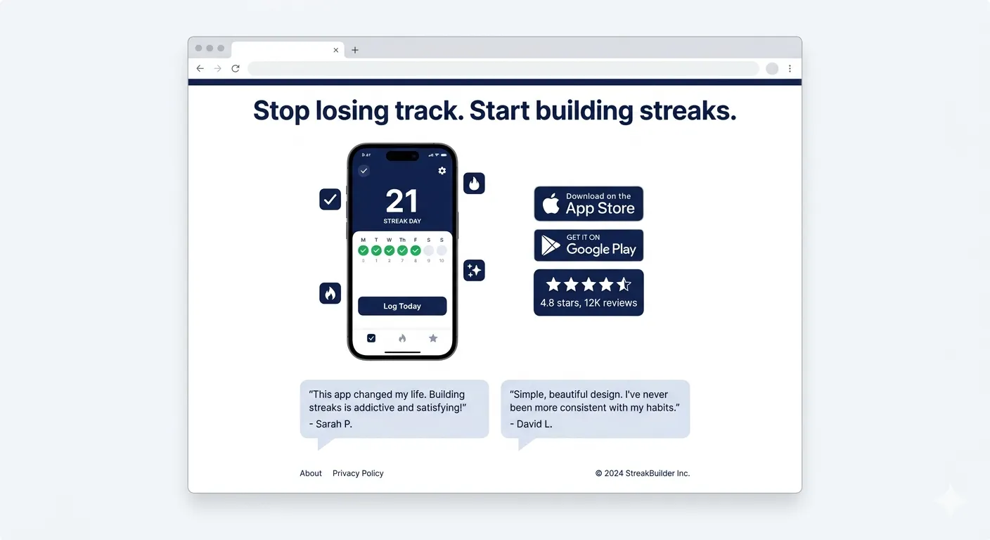
This was the second change we made on the habit-tracker, and it was the one that genuinely surprised me. We replaced our splash screen screenshot with a real shot of the streak calendar mid-use, a row of filled green checkmarks with a small text callout reading 'Never break the chain.' No logo, no tagline, just the product doing the thing people actually wanted from it. Within two weeks our conversion rate moved again, this time from 7.1% to 11.3%. Combined with the icon change, we had nearly tripled our original conversion rate without touching a single line of app code.

Fig. 2 — CVR uplift potential by listing element. Rating improvement and icon optimisation consistently outperform copy changes. Sources: SplitMetrics, AppTweak, Sensor Tower (2026)
Tactic 3: Protect and Improve Your Rating Before You Drive More Traffic
Apps that improved their rating from 3.6 to 4.2 stars saw 60% higher conversion rates (AppTweak, 2026). A 4.0 star app converts at roughly 50% lower than a 4.5 star app (DEV Community, 2026). And in 2026, 90% of featured apps on both stores maintain ratings of 4.0 or higher.
Sending paid traffic to an app rated below 4.0 is spending money to fill a bucket with a hole in it. The rating does not just affect conversion. In 2026, it is a ranking signal. Both stores are weighting engagement quality metrics more heavily in their algorithms, and rating is a direct proxy for that quality.
How to systematically improve your rating in 2026
Trigger the native in-app review prompt immediately after a genuine success moment: completing onboarding, finishing a session, reaching a milestone, achieving a goal. The timing determines the sentiment of the review far more than the prompt's wording.
Give users a private feedback path before they can leave a public review. A simple 'Was something wrong?' flow with an email field catches frustration early and redirects it away from the store.
Respond to every negative review within 48 hours in 2026. Both stores surface developer responses prominently. Prospective users read them. A thoughtful, specific response to a complaint converts skeptics more reliably than an additional positive review.
Email your most engaged cohort asking for a review directly. Define engaged: users who have opened the app more than 5 times in the first week. Do not blast your full list. Quality of reviewer predicts quality of review.
Update the app regularly. The stores' algorithms interpret recent updates as signals of an active, maintained product. Apps with no updates in 6 months see organic ranking decay regardless of their rating.
We were sitting at 3.7 stars when this project started, which I now believe was quietly capping every other improvement we made. We moved our review prompt from app launch, where it had always lived, to the moment a user completed their seventh consecutive day on a streak. That single timing change took us to 4.3 stars within two months, not because people suddenly liked the app more, but because we were finally asking the people who already did.
Tactic 4: Use Custom Product Pages to Match Intent
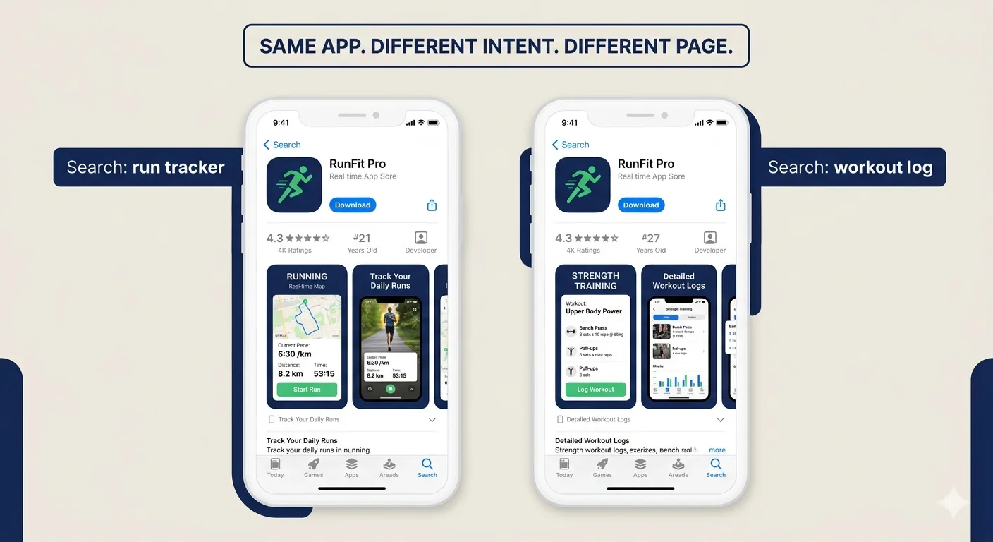
Custom Product Pages (CPPs) on iOS allow you to create up to 70 different versions of your app store listing, each with different screenshots, promotional text, and app previews. In 2026, CPPs are available in organic search results, not just paid campaigns. That is a 2026-specific change that makes them relevant for every developer, not just those running Apple Search Ads.
Apps using CPPs see an average +8.6% CVR boost on generic keyword campaigns and +5.9% on app-specific campaigns (AppTweak / Apple, 2026). And only 31% of apps use them. That is free conversion uplift available to the majority of the app market that is simply being left on the table.
How to implement CPPs effectively in 2026
Map your top 5 organic keywords to separate CPPs. A fitness app should show running-focused screenshots to someone searching 'run tracker' and strength-training screenshots to someone searching 'workout log'. Same app. Different intent. Different page.
Match the CPP to any paid ad creative. Users who click an ad and land on a store page that mirrors the ad's visual and message convert at higher rates. Disconnects between ad and listing destroy trust.
Start with your two highest-volume keywords and one generic campaign keyword. Measure CVR difference. Iterate.
Google Play offers Store Listing Experiments for the same purpose. If you are on Android, run store listing A/B tests for screenshots before committing to a full change.
Tactic 5: Add a Preview Video That Hooks in 3 Seconds
A 15 to 30 second preview video can increase app store conversion by 20 to 35% (AppTweak / DEV Community, 2026). That is one of the largest single-element CVR uplifts available on a store listing. Yet most apps either have no video or have a video that opens with a logo animation and branded music.
In 2026, users scroll past anything that does not immediately communicate value. The first 3 seconds of your preview video are the only seconds that matter for conversion. Everything after is watched by users who are already leaning toward installing.
What the first 3 seconds of a high-converting preview video must show
The app in real use. A real screen. A real action. Not a product shot, not a brand animation.
The exact moment of value. Not what the app is. What it does for the user, immediately visible.
No voiceover for the first 3 seconds. The video plays silently in the store by default. The visual must work without sound.
No logo. No tagline. No 'Introducing...' title card. Start with the product, not the pitch.
The rest of the video can build context: additional features, social proof, a clear call to action screen at the end. But if second 1 to 3 does not communicate value, the rest is irrelevant.
Tactic 6: Rewrite Your Description for the 1% Who Read It
Only 1% of store visitors read the full description (SplitMetrics, 2026). That sounds like a reason to deprioritize it. It is the opposite. The 1% who read it are your highest-intent visitors. They want to be convinced and they have not been yet. A weak description at this point loses a user who was one paragraph away from installing.
On Google Play, the description is also indexed by Google's search algorithm. Keywords buried in the long description affect your organic ranking in Google Search, not just the Play Store. This makes the description a dual-purpose asset: conversion tool and SEO signal.
What to change in your description in 2026
Rewrite the first three lines as if they are the only lines that will be read. They appear before the 'More' fold on iOS. Lead with the strongest benefit, not a feature list.
Use social proof in the description body. Specific numbers beat vague claims. '500,000 runners use this app' converts better than 'popular fitness app'.
Include your primary keyword naturally in the first sentence. Both stores weight early keyword placement more heavily than keyword density deeper in the copy.
Use short paragraphs and line breaks. Dense text is abandoned. White space is read.
End with a specific call to action. 'Download free and track your first run in under 2 minutes' closes the loop for the user who has read to the bottom.
Tactic 7: Build a Landing Page That Converts Before the Store
The app store listing is not the only place visitors convert. Every click that lands on a website, a blog post, an influencer link, or a paid ad should first reach a landing page you control before it hits the store.
A dedicated app landing page gives you two things the store cannot. First, a surface you own completely. Second, a higher-intent visitor when they do reach the store. Users who arrive at the store after engaging with a landing page have already been pre-sold on the value proposition. They convert at higher rates than cold store traffic.
What a high-converting app landing page needs in 2026
Headline that names the problem solved, not the app name. Users are searching for solutions, not brands.
A 30-second demo video showing real in-app moments. Autoplay, muted, looping. No marketing animation.
3 to 5 specific benefit bullets. Not feature descriptions. Outcome statements: what users do with the app, not what the app does.
Social proof: your store rating displayed prominently, a download count, and 2 short user quotes with names and photos if possible.
Two download CTA buttons: App Store and Google Play. Above the fold. Large enough to tap on mobile without zooming.
An email capture for visitors who are not ready to install today. A pre-launch or waitlist email delivers higher conversion than any remarketing campaign.
Page load under 2 seconds on mobile. Google's data shows 53% of mobile users abandon a page that takes longer than 3 seconds to load.
The fastest way to build one in 2026: paste your App Store or Google Play link into Entro (entro.work). It generates a professional, conversion-optimized landing page automatically. No design work, no developer required. You go from link to live page in minutes, then start driving traffic the same day.
We did not have a tool like this when we were fixing the habit-tracker, so we hand-built our landing page over a weekend, and it showed. It took us almost three weeks to get a version live that actually moved the needle. Looking back, half of that time was spent on layout and image sizing that had nothing to do with the actual message. If I were doing it again today, I would generate the page first and spend that saved time on the copy and the demo video instead, which is where the real conversion gains live.
Tactic 8: Convert Web Traffic With Smart Banners and Deep Links
60% of brand acquisition campaigns direct users to mobile web, despite apps being the primary service platform (Airbridge, 2026). That gap is a conversion opportunity. Mobile web users who are already interested in your product or content are exactly the users you want converting to app installs. But without a direct, frictionless bridge, most of them never make the jump.
Smart banners are the primary tool for web-to-app conversion. They appear at the top of a mobile browser session with a one-tap install or open option. For users who already have the app, the banner deep-links them back into the relevant in-app content. For new users, it routes them to the correct app store with their context preserved.
How to make web-to-app conversion work in 2026
Implement smart banners on every high-intent page of your mobile website: product pages, feature pages, blog posts that match your app's use case. Not your homepage. High-intent pages.
Use deferred deep linking. When a user clicks the banner, installs the app, and opens it for the first time, deferred deep linking sends them directly to the content they were viewing on the web. A user reading your blog post about running should land in the running log section of your app, not your generic home screen. AirAsia achieved a 5% increase in total installs using this approach (AppsFlyer, 2026).
Keep the banner's CTA specific to the page context, not generic. 'Track this workout in the app' on a fitness content page converts better than 'Download our app'.
Measure web-to-app separately from other acquisition channels. Your web traffic is often your cheapest source of installs. One SEO-driven blog visitor at $0.30 converting to an install at 3% delivers an effective CPI of $10 but with far higher intent than a cold paid install.
Web-to-app tactic | What it does | 2026 benchmark |
|---|---|---|
Smart banner (top of page) | One-tap bridge from mobile web to App Store or app | 2 to 5% of web visitors install |
Deferred deep link | Preserves context through install, lands user in right in-app location | Blog-to-subscriber +4.2% with deep linking vs 1.8% without |
Exit-intent interstitial | Full-screen prompt before user leaves a high-intent page | Higher intent, use sparingly |
In-content CTA | Contextual install prompt embedded in relevant content | Matches user intent at the moment of highest relevance |
QR code on desktop | Desktop visitors who prefer mobile can install directly | Zero friction for multi-device users |
Tactic 9: Run A/B Tests on Every Conversion Surface
In 2026, conversion rate optimization is not a one-time project. It is an ongoing discipline. The apps that compound conversion gains over time are the ones that test continuously, not the ones that redesign once and move on.
Both major stores now provide built-in testing infrastructure. Google Play's Store Listing Experiments and Apple's Product Page Optimization let you run statistically significant A/B tests on your store listing without any third-party tools.
What to test first, in priority order
Element | Why it comes first | Tool to use | Time to significance |
|---|---|---|---|
Icon | Highest single-element CVR impact (+30%) | Google Play Experiments / Apple PPO | 30 to 90 days |
First screenshot | 83% of visitors never see screenshot 3+ | Apple PPO / SplitMetrics | 30 to 60 days |
Screenshot sequence | Reorder can drive +6.4% uplift with zero new assets | Both store consoles | 30 days |
Preview video | +20 to 35% uplift. Most apps have no video or a poor one | Apple PPO | 30 to 60 days |
Headline / subtitle | Keyword and benefit framing affects both ranking and CVR | AppTweak / AppFollow tracking | Ongoing |
Landing page headline | Different angles on the same problem convert differently | Your analytics tool | 7 to 14 days |
CTA button copy | Small wording changes on download buttons affect click-through | Landing page A/B tool | 7 to 14 days |
Testing rules for 2026
Test one variable at a time. Changing the icon and the screenshots simultaneously makes it impossible to know which one drove the change.
Wait for statistical significance before calling a winner. Apple PPO requires 30 to 90 days depending on traffic volume. Do not end a test early because you see a positive trend.
Apply learnings from one element to inform hypotheses for the next. A color scheme that wins in your icon may inform your screenshot background choices.
Document every test and its result. Conversion learnings compound when you can see patterns across a year of tests, not just the most recent one.
Tactic 10: Add Trust Signals at Every Friction Point
In 2026, app installs require trust. Users are cautious about app permissions, data privacy, and storage. They have been burned before. Trust signals at every friction point in the conversion journey reduce the hesitation that turns intent into abandonment.
Trust signals work because they answer unspoken objections. A user who is hovering over the download button is not unconvinced. They are looking for a reason to feel confident. The right trust signal at the right moment tips that balance.
Trust signals that move conversion in 2026
Download count displayed prominently. '2 million downloads' is a social proof statement that requires no effort to process.
Named testimonials with photos. Generic 'Great app!' quotes do nothing. Specific outcomes from real named users do.
Media mentions and press badges. 'As featured in Forbes' or 'App of the Day' triggers editorial credibility signals that advertising cannot replicate.
Privacy commitment visible without scrolling. In 2026, data transparency is a conversion factor, especially for productivity, health, and finance apps.
Free trial or freemium framing on your landing page and store listing. 'Free to download' removes the financial friction of the install decision.
Response rate on reviews. Developers who respond publicly to reviews in the store are demonstrating an active, accountable team. Users notice.
What works | What kills conversion |
|---|---|
Benefit-led first screenshot showing real UI | Logo or splash screen as first screenshot |
Icon designed for legibility at 60px | Dense text in descriptions nobody reads |
Rating of 4.0+ before running paid traffic | Generic CTAs like 'Download now' with no context |
Custom Product Pages matched to search intent | Running paid ads to a listing below 4.0 stars |
Deep linked smart banners on high-intent pages | Sending web traffic straight to the store with no warm-up |
Preview video that shows value in first 3 seconds | Preview video that opens with a logo animation |
Landing page with social proof and dual download buttons | Missing or outdated screenshots after a major UI change |
Regular app updates as a ranking and trust signal | No response to negative reviews in the store |
A Final Note from the Writer
In 2026, the apps that grow are not the ones with the most traffic. They are the ones that lose the fewest visitors at each stage of the funnel.
I think about that habit-tracking app often. Six weeks after we started, our conversion rate had gone from 4.75% to just over 19%. Same TikTok creator, same ad budget, same store category. The only thing that changed was how much of our existing traffic we kept instead of losing at the door. That single shift was worth more to our growth that quarter than anything we could have bought with additional ad spend.
The math is unforgiving. A 25% CVR means three out of four visitors who find your app leave without installing. Even a 5 percentage point improvement changes the economics of every channel you operate. Your paid ads get cheaper. Your organic rankings produce more. Your influencer campaigns deliver better ROI. Conversion improvement compounds simultaneously across every traffic source. I watched it happen with our own numbers, and it is the reason I now look at conversion before traffic on every app I touch.
The good news is that conversion is largely within your control. Your rating, your icon, your first screenshot, your landing page, your web-to-app flow. These are not algorithmic mysteries. They are assets you can test, measure, and improve with data that is available to you right now.
Start with the three levers that move conversion the most: get your rating above 4.0, redesign your icon for legibility at 60 pixels, and rewrite your first screenshot as a single specific benefit. Then build a landing page that warms up every visitor before they reach the store.
The fastest way to build that landing page: generate your app landing page with Entro. Paste your App Store or Google Play link. You go from link to live, conversion-optimized page in under 5 minutes. Then run the 10 tactics in this guide in the order that matches your biggest current leak. The installs will follow.
Frequently asked questions
It depends entirely on your category. The all-category average on iOS is 25% and on Google Play is 27.3% (AppTweak, 2026). Business apps should aim for 65% or above. Gaming apps sit between 3 and 5%. The right benchmark is your specific subcategory, not the overall average. If your CVR is below your category benchmark, every other marketing investment is operating at a discount. Fix conversion first.
Rating is the single most impactful element relative to effort: apps that improved from 3.6 to 4.2 stars saw 60% higher CVR (AppTweak, 2026). Among listing assets you can change without changing the product, the icon has the highest documented uplift potential at up to +30% (SplitMetrics). The first screenshot is second at +21.7%. These three: rating, icon, and first screenshot, should be the first areas any app team addresses before investing more in traffic acquisition.
Custom Product Pages are alternate versions of your iOS App Store listing with different screenshots, promotional text, and app previews. In 2026 they work in organic search results, not just paid campaigns. You can have up to 70 CPPs per app. They allow you to show running-focused screens to someone searching 'run tracker' and strength-training screens to someone searching 'workout log'. The same app, matched to the user's specific intent at the moment of discovery. CPPs deliver an average +8.6% CVR lift, and only 31% of apps currently use them.
Web-to-app conversion is the process of converting mobile website visitors into app installs through smart banners, in-content CTAs, and deferred deep links. The typical web-to-app conversion rate is 2 to 5% of mobile web visitors (Adjust / Botsi, 2026). Higher for high-intent pages like tool demos and feature pages. Lower for informational content like blog posts. The key to making web-to-app work is deferred deep linking: when a user clicks the install banner, installs the app, and opens it for the first time, they land directly in the relevant in-app content rather than a generic home screen. AirAsia achieved a 5% increase in total installs using this approach.
Fix conversion first. Always. In 2026, iOS CPI averages $5.84. Spending more on paid traffic to send to a listing that converts at 15% instead of 30% doubles your effective CPI. Conversely, improving your CVR from 20% to 30% is a 50% reduction in your effective CPI on every existing and future traffic source, paid or organic. The same traffic, better conversion, lower cost per install. Conversion optimization compounds across every channel simultaneously. No other investment does that.
Use Google Play's Store Listing Experiments for Android. Use Apple's Product Page Optimization for iOS. Both are built into the store consoles and require no third-party tools. For landing pages, any standard A/B testing tool works. Test one element at a time. Start with your icon, then your first screenshot, then screenshot sequence. Wait for statistical significance: Apple PPO needs 30 to 90 days depending on your traffic volume. Document every test result to build a conversion learning library over time.
A landing page warms up visitors before they reach the store. Users who arrive at your app store listing after engaging with a well-designed landing page have already processed your value proposition, seen social proof, and watched a demo. They arrive with higher intent and convert at higher rates than cold store traffic. A landing page also gives you a surface you own completely, where you can collect emails from visitors not ready to install today and retarget them later. Entro (entro.work) generates a professional app landing page instantly from your App Store or Google Play link.
The most impactful trust signals in 2026 are: your star rating displayed prominently on your landing page and store listing (the single biggest conversion driver), named testimonials with specific outcomes rather than generic praise, download or user count as social proof, media mentions or editorial badges, and a visible free trial or freemium framing that removes the financial hesitation from the install decision. For health, finance, and productivity apps, a brief privacy statement or data transparency note near the download button addresses the top unspoken objection in those categories.

Written by
Cyrus
Cyrus writes about mobile app marketing, ASO, and the craft of turning App Store reviews into product insight. He covers the patterns that move installs, the metrics that actually matter, and the small details indie developers tend to miss.