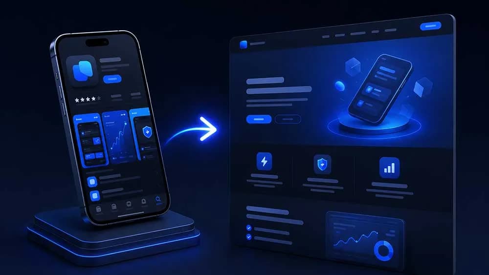
How to Turn Your App Store Listing Into a Landing Page
Your App Store listing already has reviews, screenshots, and a description. Here's how to turn that into a landing page that converts cold traffic in 2026.
Cyrus
How to Turn Your App Store Listing Into a Landing Page
You have an App Store listing. You have reviews. You have a description you rewrote four times. And yet when someone asks where they can learn more about your app, you send them to Apple's store page and hope for the best.
That's a conversion problem. Here's how to fix it.
Why the App Store Is a Terrible Landing Page
Apple controls the layout. Apple controls what shows above the fold. Apple shows your competitors in the sidebar. The person you sent there has to tap through screenshots, scroll past ratings, and decide whether to trust a stranger's app before they've even read your tagline.
A landing page that you control does the opposite. It filters, it explains, it builds trust on your terms. The App Store is where someone goes to download. A landing page is where someone goes to decide.
The gap between those two jobs is where most indie developers lose users they already paid to acquire.
What Your App Store Listing Already Contains
Here's the part most developers miss: the raw material for a great landing page is sitting in your App Store listing right now.
Your reviews are customer testimonials. Your screenshots are feature callouts. Your description is a value proposition, even if it reads like one. Your star rating is social proof. You didn't need to write any of this fresh. You just need to reassemble it.
Specifically, look at:
- One-star reviews that describe a real problem (they tell you what the audience cared about before they downloaded)
- Five-star reviews that use specific language ("I lost 8 pounds in 30 days" beats "great app" every time)
- The first sentence of your description (it either hooks or it doesn't)
- Your screenshot captions (if they say "Feature 1" you have work to do)
The five-star reviews with specific outcomes are your headline candidates. Steal their language. A real user wrote "finally a habit tracker that doesn't make me feel guilty when I miss a day." That sentence belongs on your landing page, not buried in the App Store.
The Page Structure That Actually Converts
This isn't complicated. Resist the urge to make it complicated.
Above the fold: Your app icon, one headline (stolen from a review or your best description sentence), one subheadline that clarifies who it's for, and a single download button. That's it. No navigation. No three-column layout. No background video.
Social proof block: Three to five reviews, hand-picked for specificity. A meditation app might show: "I've tried Calm and Headspace. This is the only one I've actually used every day for six months." That review is doing more work than any marketing copy you could write.
Feature section: Three features maximum. Each one paired with a screenshot. Each screenshot caption describes a user outcome, not a UI element. "See exactly where your money went" beats "Transaction view screen."
FAQ: Answer the three objections you see most often in one-star reviews. If people keep asking whether the app works offline, answer it here before they ask it. Removing doubt is the same job as adding desire.
Final CTA: One button. App Store badge if iOS, Play Store badge if Android, both if you're cross-platform. No email capture, no newsletter popup. You want a tap, not a subscriber.
If you're building for games specifically, the best landing page builders for indie game devs in 2026 follow this same structure, with one addition: a short gameplay clip replaces the screenshot section.
How to Mine Your Reviews for Copy
Open your App Store Connect. Filter by five stars. Sort by most recent. Read 50 reviews.
You're looking for:
- Repeated phrases (if three people say "finally" you've found a before/after narrative)
- Specific numbers ("20 minutes a day", "dropped from 180 to 162 pounds", "saved me $400")
- Comparisons to competitors (these tell you your positioning)
- Emotional language ("I was embarrassed to show people my photos before")
Copy those phrases into a doc. Group them by theme. You now have your headline options, your feature copy, and your testimonial block. All of it written by your actual users, in their actual words.
This is why tools that generate landing pages from App Store reviews have gotten so much attention from solo founders in 2026. The copy problem is already solved. The assembly problem is what takes time.
The One Mistake That Kills Conversion
Building two separate pages: one for iOS, one for Android, neither of them linked anywhere useful.
Pick one URL. Put it everywhere: your Twitter bio, your Reddit posts, your ProductHunt listing, your press kit. That URL should work whether someone is on desktop, iPhone, or Android. It should detect the device and show the right store badge, or better, show both and let the user choose.
Your landing page URL is a marketing asset. An App Store URL is not. apps.apple.com/us/app/your-app/id123456789 is hard to say, hard to remember, and hands Apple credit for every conversion you earned.
yourapp.com or yourapp.entro.work converts the same traffic and builds something you own.
Speed Is a Feature Too
In 2026, page load time directly impacts paid acquisition ROI. If you're running Meta or TikTok ads to a landing page that takes 4 seconds to load on mobile, you're burning money. Google's Core Web Vitals still gate organic traffic. A slow page is a leaky bucket.
Use a static site or a purpose-built tool. Don't build your app landing page on a WordPress theme from 2019 with seventeen plugins. The page has one job. It should load in under 1.5 seconds on a mid-range Android device on 4G.
If you're comparing options on what to build with, the best landing page builders for mobile app developers breakdown covers build time, pricing, and performance benchmarks across the main tools indie devs are actually using.
What to Do Next
Open your App Store listing right now. Read your five most recent five-star reviews. Pick the one that contains a specific number or outcome. That sentence is your next headline. Paste it into whatever page builder you're using, add your app icon, add a download button, and you have a better landing page than 80% of indie apps in your category. If you want to skip the manual assembly entirely, Entro turns your App Store and Google Play reviews into a ready-to-publish landing page in about 60 seconds. Either way, stop sending paid traffic to Apple's page.
Written by
Cyrus
Head of Marketing, Entro
Cyrus writes about mobile app marketing, ASO, and conversion optimization. He's spent the last 3+ years helping indie developers and startup founders get more downloads from organic channels, without paid UA budgets.
Before Entro, he ran growth for two consumer apps that together passed 500,000 downloads on the App Store. Most of what he writes comes from mistakes made with his own money first.
Related articles


