App Store Screenshot Tips That Actually Convert in 2026
My first app screenshot was a raw export of the home screen with no text, no context, and no reason for anyone to care. One redesign later, conversion rate went up 22%. Here is exactly what changed and why.

Cyrus
The first screenshot I ever designed for an app was a raw export of the home screen. White background, status bar visible, no text, no context. Just the UI sitting there like a passport photo. I thought it looked clean. Professional, even.
Our conversion rate thought otherwise.
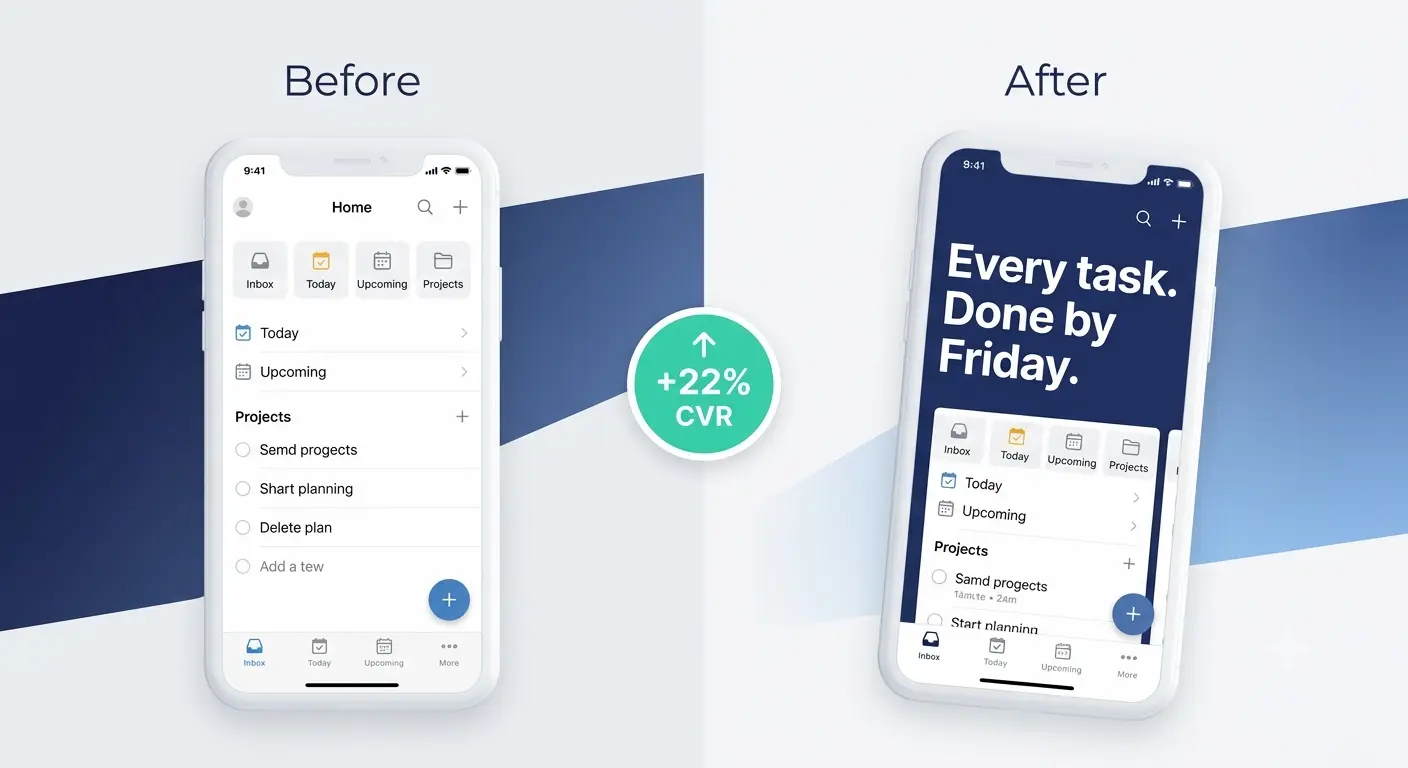
I found out how wrong I was six months later when I finally had the time to run a proper A/B test. The replacement screenshot had a benefit-led headline in large type, the app UI shown at a natural angle inside a device frame, and a background colour that matched the product's brand. Three changes. Conversion rate went up 22% in the first 30 days.
That was the moment I understood something that has stayed with me ever since: screenshots are not documentation of your app. They are the advertisement for it. The user has not installed yet. They do not know what the app does, what it looks like in motion, or whether it is worth their time. They are making that judgment in the 2 seconds they spend looking at your first image.
In 2026, 60% of users decide whether to install within 5 to 7 seconds of landing on an app listing (AppDrift, 2026). Only 4% of users enlarge portrait screenshots to look more closely. The thumbnail they see in search results is where most decisions are made. And research consistently shows that optimised screenshots are the single highest-impact element for improving App Store conversion rates, outperforming description changes, keyword updates, and rating improvements in most A/B tests.
This guide covers everything: dimensions, design principles, caption strategy, common mistakes, A/B testing, and the before-and-after differences that actually move the number. In the order you should think about them.
The 2026 Dimensions: What You Actually Need to Upload
Apple simplified screenshot requirements significantly in late 2024. You no longer need to upload screenshots for every device size separately. Here is the current state in 2026.
Device | Required dimensions | Notes |
|---|---|---|
iPhone 16 Pro Max (6.9") | 1320 x 2868 px | Primary recommended size. Apple scales down for all other iPhones. |
iPhone 15 Pro Max (6.7") | 1290 x 2796 px | Accepted. Apple scales for older models if 6.9" not provided. |
iPad Pro 13" | 2064 x 2752 px | Required if your app supports iPad. Apple scales for smaller iPads. |
iPad Pro 12.9" (older) | 2048 x 2732 px | Still accepted. Use 13" if submitting fresh assets in 2026. |
Mac | 1280 x 800 px minimum | Required if your app is on Mac. Separate set from iPhone. |
Apple Watch | Watch-specific dimensions | Required for watchOS apps. Check App Store Connect for current specs. |
2026 practical rule: Design one set at 1320 x 2868 pixels (iPhone 6.9") and one set at 2064 x 2752 pixels (iPad 13"). Apple handles scaling for every other device size. You no longer need separate sets for 6.7", 6.5", or 6.1" iPhones. This is a significant time saving compared to even two years ago.
Format: PNG or JPEG. PNG is recommended for screenshots with text overlays, as JPEG compression can soften edges.
Maximum: 10 screenshots per localized listing. Fill all 10. Every empty slot is conversion opportunity you are not using.
Orientation: Portrait for portrait apps, landscape for landscape apps. Do not mix orientations within a set.
Minimum: 1 screenshot required. Apple will reject a submission with no screenshots.
Tip 1: Treat Screenshot 1 as the Only Screenshot That Matters
This sounds extreme. It is not.
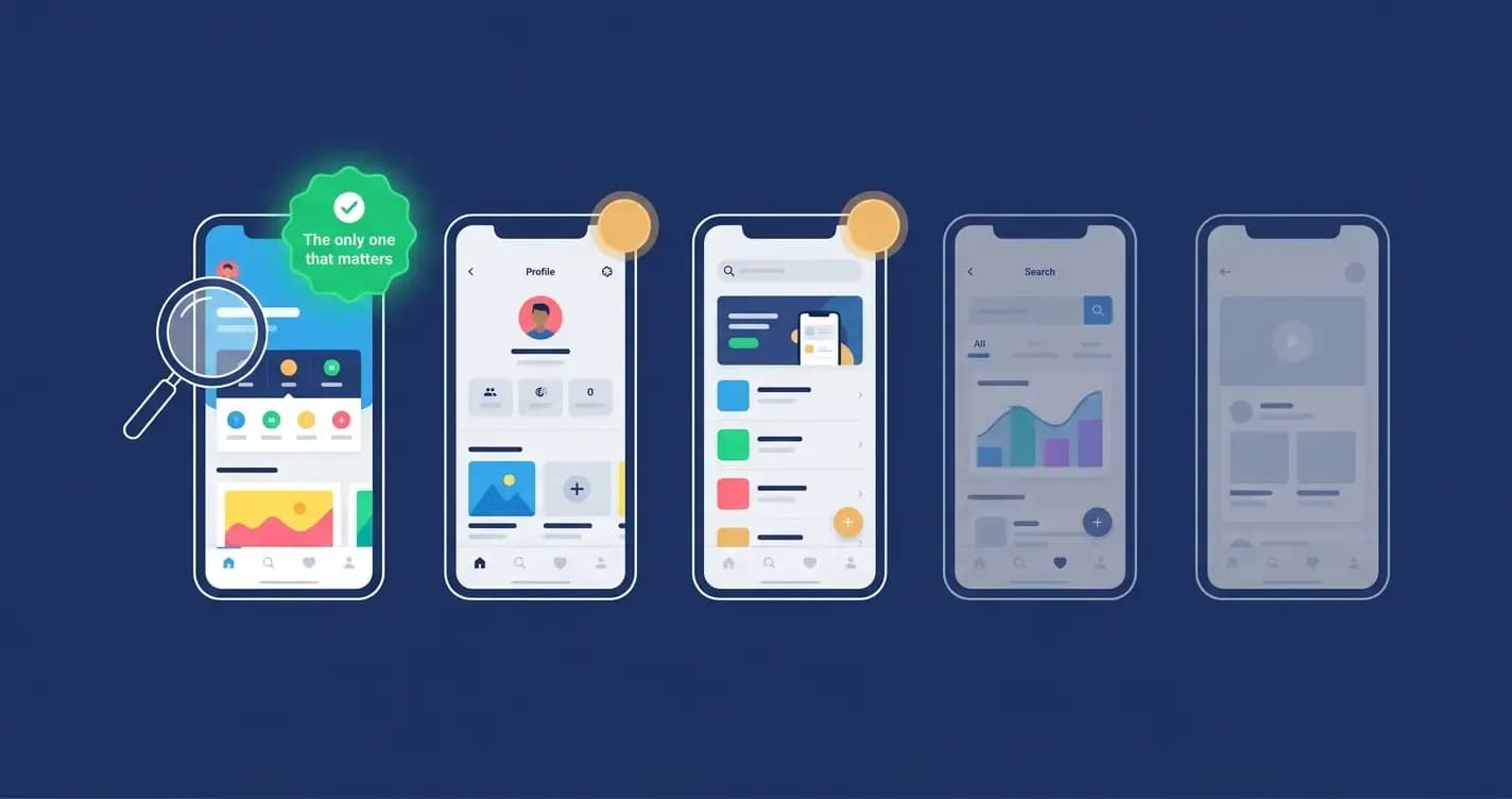
Only 4% of users enlarge portrait screenshots to view them more closely (MobiLoud, 2026). In App Store search results, only the first 2 to 3 screenshots are visible before the user has to tap through to the listing page. Most users make their download decision without tapping. That means your first screenshot is doing the vast majority of the conversion work for the vast majority of your audience.
I redesigned the first screenshot on a productivity app three times over six months. Each time I ran an A/B test through Google Play's Store Listing Experiments. The version that won, and the version that still runs, leads with a single benefit statement in 40pt bold type above the app UI. Not a feature. Not the app name. A benefit. 'Every task done by Friday' for a task management app. 'Never double-book again' for a scheduling app. One sentence that names the specific outcome the user gets.
What screenshot 1 must do in 2026
Communicate the app's single most compelling value in under 2 seconds at thumbnail size.
Show real app UI, not an illustration, not a marketing render. Apple's guidelines require actual in-app screens.
Include a benefit-led headline in large, readable type. If the text requires two reads to understand, it is too long.
Have enough contrast that it is visible in both light mode and dark mode App Store environments.
Never show a splash screen, login page, onboarding step, or empty state. Show the moment of value.
Tip 2: Structure Your Screenshot Set as a Story
Your screenshots are not a gallery. They are a sales sequence.
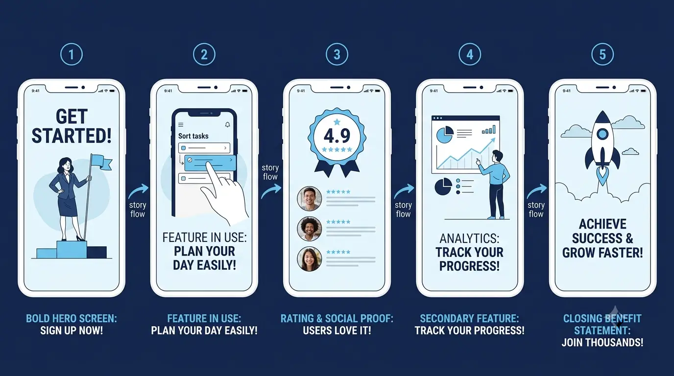
The apps with the highest-converting screenshot sets in 2026 treat the full set of screenshots as a structured narrative: screenshot 1 hooks with the core value, screenshots 2 through 4 prove that value with specific benefits and key features, screenshots 5 through 7 add depth and social proof, and screenshot 8 closes with a clear call to action or a secondary benefit that removes a final objection.
Screenshot slot | Purpose | What to show |
|---|---|---|
1 (hero) | Hook. Stop the scroll. Communicate core value in 2 seconds. | Core benefit headline + signature app moment + strong background |
2 | Prove value. Show the most important feature in use. | Feature in action + short benefit caption + real UI populated with data |
3 | Build credibility. Social proof or second strongest feature. | User count / rating / press mention, or feature 2 in context |
4 | Address a common objection or secondary use case. | The 'yes but what about...' scenario your users ask about most often |
5 | Feature depth. Show something that surprises or delights. | A feature that users discover and love but would not have expected |
6 to 7 | Supporting evidence. Category-specific features or differentiators. | What makes your app different from the obvious competitor |
8 to 10 | Close. Final benefit or social proof. CTA if appropriate. | Outcome statement, rating, download prompt, or a feature that reduces risk |
Revolut applies this structure precisely. Each screenshot highlights a distinct benefit (save money, send money, get paid early) rather than listing features. Spotify uses simple one-line captions in large type over each screenshot. Both are examples of screenshots that function as a sequential argument for downloading, not a random selection of UI screens.
Tip 3: Write Captions That Work at Thumbnail Size
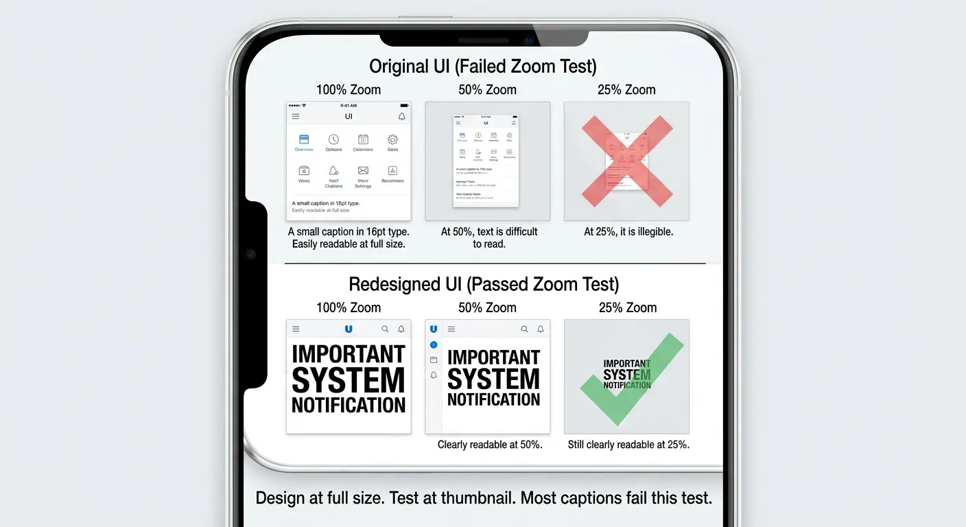
Most screenshot captions are written at 100% zoom in Figma and never previewed at the actual size users see them in the App Store.
That is how you end up with 12-word captions in 18pt type that are completely illegible as a thumbnail. The user's eye lands on the screenshot, reads nothing, and moves on.
The rule I apply on every screenshot set I work on: preview every screenshot at 25% of its full size. That approximates what a user sees in App Store search results on a standard phone. If you cannot read the headline comfortably at 25% zoom, it is too small or too long or both.
Caption principles for 2026
Use at minimum 120pt font for headlines when designing at full resolution. Larger is almost always better.
Maximum 6 to 8 words per caption. Treat it like a billboard: if it takes two reads, cut it.
Use high contrast between the text and the background. White text on dark background or dark text on light background. Never grey on grey.
One idea per caption. Not a summary of the screen. The single strongest thing the user should take from this frame.
Plain, specific language over hype. 'Respond in 30 seconds' beats 'Lightning-fast messaging.' 'Track any habit in 5 seconds' beats 'Powerful habit tracking.' Specific always wins.
Tip 4: Use Real UI, Realistic Data, and Real Context
This is one of Apple's actual requirements, not just a best practice. Screenshots must show the real in-app UI. No abstract art that does not reflect the actual experience. No conceptual renders that misrepresent the product.
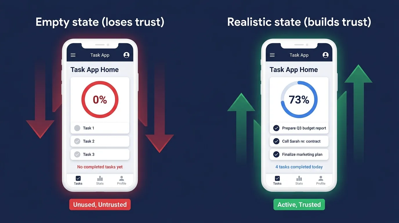
Beyond compliance, there is a conversion reason. Neuromarketing research consistently shows that depicting real-life scenarios with people using the app is more effective than showing isolated UI (AppTweak, 2026). Users are trying to answer one question when they look at your screenshots: is this what I will actually see and use? A screenshot populated with realistic, meaningful data answers yes more convincingly than a perfectly designed but obviously empty interface.
What 'realistic data' means in practice
A task management app screenshot should show real-sounding tasks, not 'Task 1', 'Task 2', 'Task 3.'
A finance app should show realistic account balances and transaction names, not '$0.00' and 'Test Transaction.'
A fitness app should show a completed workout, a real streak, or a genuine progress chart, not a fresh empty state.
A social app should show messages that read like real conversations, not 'Hello World' and 'Test message.'
An empty inbox, a blank dashboard, or a zero-state communicates that the app has nothing in it. The user interprets it as a signal about the product, not as an understanding that it would have real data in use.
Tip 5: Design for Dark Mode and Light Mode
In 2026, a meaningful percentage of App Store users have dark mode enabled on their devices. The App Store itself respects the system setting, meaning your screenshots will be displayed on dark backgrounds for some users and light backgrounds for others.
A screenshot with a white background that looks clean in light mode can look jarring and disconnected in dark mode when the store interface around it is dark. A screenshot with a very dark background can look heavy and hard to read in light mode.
The pragmatic solution used by most high-converting apps in 2026 is to design screenshots with mid-tone branded backgrounds, not pure white and not pure black, that look intentional in either context. Alternatively, design two sets of screenshots, one for light mode and one for dark mode, and upload them as separate localizations if your target market warrants the extra effort.
At minimum, open your App Store listing on a device with dark mode on before any major screenshot update goes live. If it looks wrong, it is wrong for a significant portion of your audience.
Tip 6: Show Your App's Signature Moment
Every app has one thing it does that no other app does in exactly the same way. The feature or interaction that made the people who built it feel genuinely proud. The moment that delighted the first beta users. The thing people describe when they recommend the app to a friend.
That moment belongs in screenshot 2 or 3 at the latest. Not buried in screenshot 7 after five screens of generic productivity features.
I once worked with a developer whose app had a genuinely novel AI journaling feature that generated a mood summary of your week from your entries and displayed it as a beautifully designed visual card. It was the thing every user mentioned in reviews. It was screenshot 8 in a 10-screenshot set.
We moved it to screenshot 2. Conversion rate moved 11% upward in the following A/B test. The signature moment was always there. It just needed to be seen before the user gave up scrolling.
Tip 7: Create a Panoramic Flow Across Screenshots
This is one of the most visually striking techniques in 2026 and one of the most consistently underused.
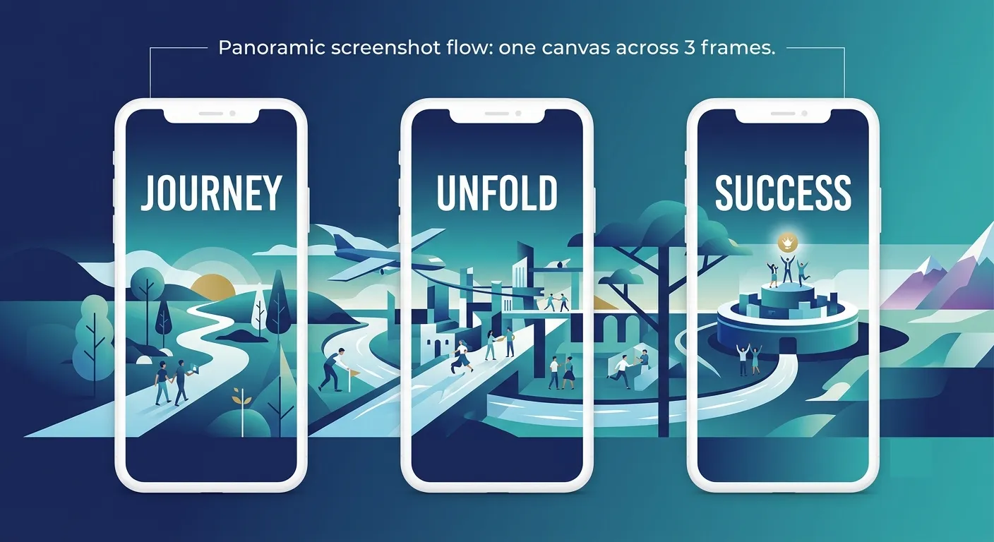
A panoramic screenshot set designs adjacent screenshots so that their backgrounds or design elements connect visually when viewed side by side. The user sees a cohesive visual landscape as they swipe through the set, rather than a collection of disconnected frames. Airbnb and TripAdvisor both use this approach, creating isometric landscape designs that flow from one screenshot to the next.
The conversion benefit is engagement. A screenshot set that rewards swiping gets swiped. More screenshots viewed means more value communicated means higher conversion. The panoramic technique is also visually distinctive in a category where most apps use identical screenshot structures, which means it catches the eye in search results.
Design the background or landscape element of your screenshot set as a single wide canvas, then crop it into individual frames.
Ensure each frame still communicates value on its own. The panoramic effect enhances engagement but does not replace individual screenshot conversion function.
Test how the transition looks on the actual App Store on a device. Screen edge rounding and spacing between screenshots vary by iOS version.
Tip 8: Add Social Proof Inside Your Screenshots
Your description might mention that 500,000 people use your app. Your rating might be 4.7 stars. But most users never read the description and the rating appears in small type above the fold.
The screenshot set is where you have the user's attention. Use it.
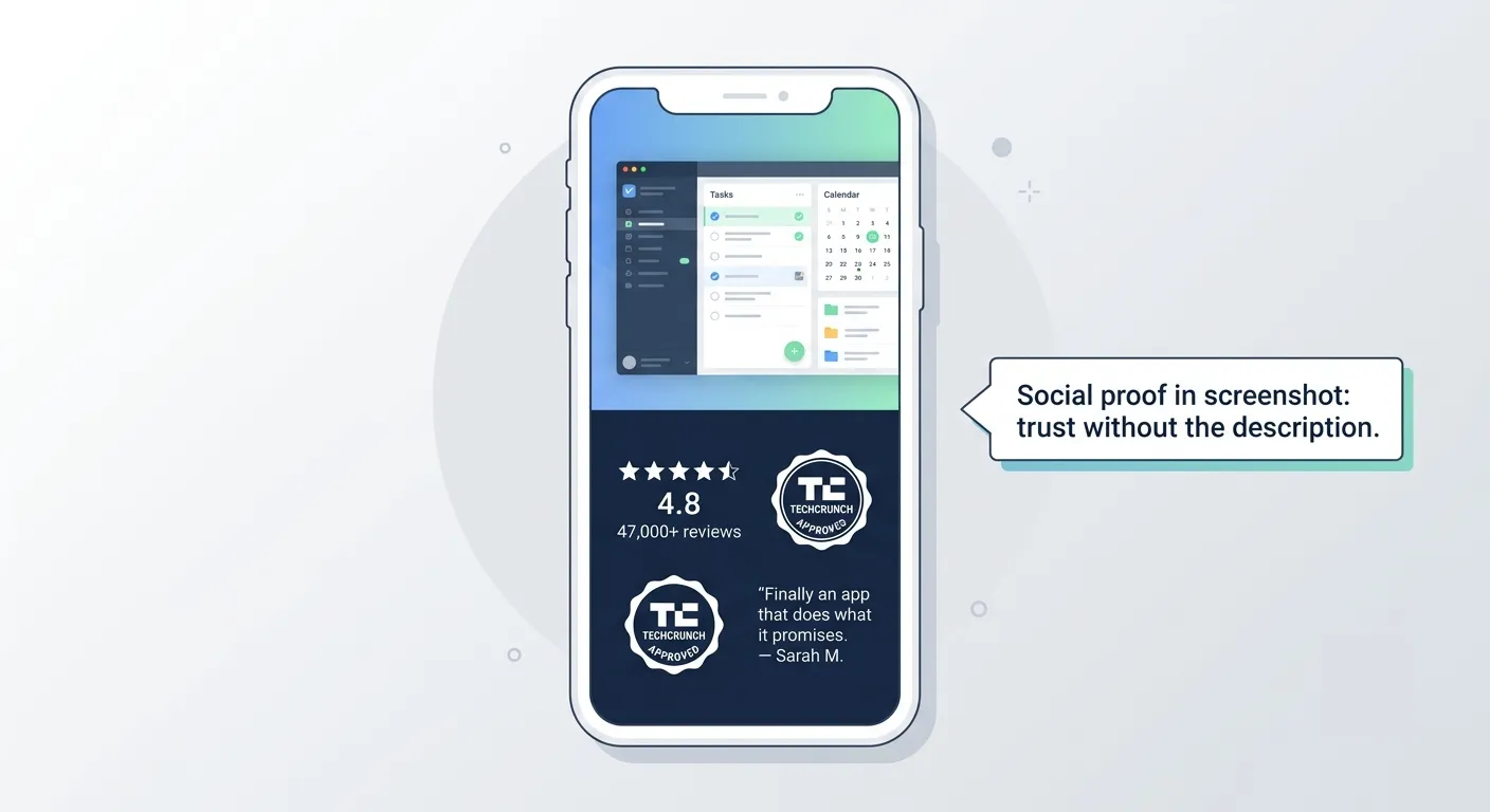
Social proof inside screenshots is one of the fastest and most credible conversion signals available because it is visual rather than textual. A screenshot frame that shows '4.8 stars from 47,000 reviews' in large type communicates trust in a way that no amount of description copy can match.
Social proof that works inside screenshots
Download or user count: 'Trusted by 500,000 runners worldwide.' Specific number beats vague claim.
Star rating display: A rendered 4.8-star graphic is more visually impactful than text.
Press mention: 'As seen in TechCrunch' or 'App of the Day, April 2026' shown as a badge.
User quote: One short, specific sentence from a real review, attributed with a first name and avatar.
Ranking achievement: '#1 in Productivity' or 'Top 10 Health App' if recently true.
Tip 9: Localize Your Screenshots for Every Major Market
This is the tip with the clearest ROI and the most consistent gap between knowing it and doing it.
Localized screenshots can increase install rates by 20 to 30% in non-English markets according to industry benchmarks (Appilot, 2026). Apple's App Store is available in 175 regions and 40 languages. If your app is reaching users in Germany, Japan, Brazil, or France with English-only screenshots, you are showing up at a disadvantage that can be fixed in a weekend.
BetterMe showed exactly how this compounds when done properly. For their Japanese store listing, they did more than translate the text overlays. They replaced food imagery with Japanese-appropriate alternatives and added manga-style character illustrations that resonated with Japanese users. The result was a significant install rate improvement in that market, not just from translation but from cultural adaptation.
What localization means for screenshots
Translate all text overlays into the target language. Start with your top 3 non-English markets by existing user base.
Adapt app UI screenshots to show locally relevant content: correct currency symbols, local date formats, local place names.
Consider cultural aesthetics, not just language. Japanese users respond differently to visual density and character representation than European users.
Use tools like LocalizeShots to automate text translation across screenshot sets. It reduces a week of design work to an afternoon.
Tip 10: A/B Test Your Screenshots Before You Commit
Everything in this guide is a hypothesis until you test it on your actual audience with your actual app.
Google Play's Store Listing Experiments and Apple's Product Page Optimization (PPO) both give you the ability to run controlled A/B tests on your screenshots before committing to a permanent change. They are free, built into the store consoles, and produce statistically significant results if you run them long enough.
The sequence I use on every screenshot project: test the first screenshot first, because it has the most impact. Run it for 30 days minimum. If it wins, ship it and move to the second screenshot. Never test more than one variable at a time. The developers who learn the most from testing are the ones who isolate variables and build a consistent record of what works for their specific audience.
What to test first | Why | Minimum test duration |
|---|---|---|
First screenshot headline copy | Highest impact single element on conversion | 30 days, 500+ impressions per variant |
First screenshot background colour | Affects visibility in search results and brand recognition | 30 days |
Screenshot sequence order | Moving screenshot 3 to position 1 can lift CVR 15%+ (Sparrow Apps, 2026) | 30 days |
Portrait vs landscape first screenshot | Landscape takes more visual space in search results | 30 days, tests only where your app suits both |
Social proof placement | Frame 2 vs frame 3 for rating/review display | 30 days |
Caption copy style | Benefit-led vs feature-led vs outcome-led | 30 days |
"Test one hypothesis at a time. Developers who change the icon and the screenshots simultaneously cannot know which one drove the result. Conversion learning is useless if you cannot isolate the variable." — Apple PPO best practices, 2026
The 8 Screenshot Mistakes That Kill Conversion
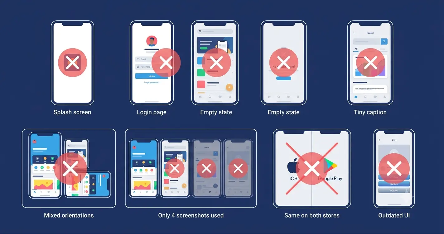
Mistake | Why it kills conversion | Fix |
|---|---|---|
Splash screen as screenshot 1 | Users see branding, not value. They scroll without understanding what the app does. | Replace with the app in action showing its core benefit. |
Login or onboarding screen | Shows the obstacle before the reward. Users read it as friction. | Show the experience after onboarding, not before. |
Empty state or placeholder data | Communicates a bare product. Users do not imagine their data there. | Populate with realistic, specific, believable content. |
Caption text too small | Illegible at thumbnail size where most decisions are made. | Minimum 120pt at design resolution. Preview at 25% before publishing. |
Mixing portrait and landscape | Creates visual inconsistency and breaks App Store display logic. | Stick to one orientation per device type throughout the set. |
Not filling all 10 slots | Every empty slot is conversion opportunity not used. | Fill all 10. The last 3 can be supporting features or social proof. |
Same screenshots on iOS and Android | Different platforms have different audiences and different display contexts. | Design separate sets with platform-appropriate messaging and format. |
Never updating after major UI changes | Outdated screenshots show an app that looks different from what users install. | Update screenshots within 4 weeks of any major UI redesign. |
Quick Reference: App Store Screenshot Checklist for 2026
Item | Requirement | Done? |
|---|---|---|
Primary iPhone size | 1320 x 2868 px (6.9" iPhone 16 Pro Max) | □ |
iPad size (if supported) | 2064 x 2752 px (13" iPad Pro) | □ |
Format | PNG (preferred for text overlays) or JPEG | □ |
Slots filled | All 10 screenshot slots used per localized listing | □ |
Screenshot 1 | Benefit-led headline, real UI, visible at 25% zoom | □ |
Screenshots 2 to 4 | Core features shown in action with realistic data | □ |
Screenshots 5 to 7 | Differentiating features, social proof, secondary benefits | □ |
Screenshots 8 to 10 | Supporting features, closing benefit, or trust signals | □ |
Caption font size | Minimum 120pt at full design resolution | □ |
Caption length | 6 to 8 words maximum per frame | □ |
Data realism | No placeholder, empty state, or test data visible | □ |
Dark mode check | Screenshots reviewed on device in dark mode | □ |
Orientation consistency | Portrait throughout (or landscape throughout if appropriate) | □ |
Localization | Text overlays translated for top 3 non-English markets | □ |
A/B test running | At least one active PPO or Store Listing Experiment | □ |
A Final Note
The passport photo screenshot that killed our conversion was up for six months before I changed it. Not because I did not know it was underperforming. Because I kept telling myself it was good enough and there were more important things to work on.
There were not. Screenshots sit at the exact moment a motivated user decides whether to install or scroll past. Everything else in your marketing, the ads, the ASO, the influencer mentions, the press coverage, is working to get someone to that moment. The screenshot is what happens at the moment itself.
Work backwards from that and the priority becomes obvious. A 22% conversion rate improvement from redesigning one screenshot is worth more than a 22% increase in traffic to an unchanged listing. You get more installs with less spend. Every channel you run improves simultaneously. The economics compound in a way that almost nothing else in app marketing does.
Start with screenshot 1. One benefit headline in large type. Your app UI populated with realistic data. A background that looks intentional in both light and dark mode. Preview it at 25% zoom. If you can read it and understand the app in 2 seconds, you are ready.
Once your screenshots are where they need to be, make sure your landing page matches. Generate one with Entro from your App Store link and give every traffic source a conversion surface that works as hard as your redesigned listing.
Frequently asked questions
Upload all 10. Apple allows up to 10 screenshots per localized listing, and every empty slot is a missed opportunity to communicate value. The first 2 to 3 screenshots do the heaviest conversion work, but users who are genuinely evaluating your app will swipe through more. Screenshot 8 through 10 are your chance to address secondary objections, add social proof, or showcase features that differentiate your app from the most obvious competitor.
The primary recommended size in 2026 is 1320 x 2868 pixels for the 6.9-inch iPhone 16 Pro Max. Apple automatically scales this for all smaller iPhone models, so you only need to upload one set. If you have existing screenshots at the 6.7-inch size (1290 x 2796 px), those are still accepted. For iPad, the recommended size is 2064 x 2752 pixels for the 13-inch iPad Pro. Design at the largest size for the sharpest possible output on all devices.
Yes. Apple's App Store review guidelines require screenshots to show the actual app experience. You cannot use abstract art, conceptual renders, or marketing illustrations that do not reflect the real in-app UI. Screenshots should show the app as users will actually see and use it. You can add text overlays, background colours, device frames, and design elements around the UI, but the UI itself must be genuine. Misrepresenting the app in screenshots is a submission rejection reason and, more practically, it sets an expectation that the app cannot meet.
No. The platforms have different audiences, different display contexts, and different design conventions. Apple users in 2026 respond better to lifestyle imagery, emotional triggers, and clean minimal design. Google Play users tend to be more feature-focused and want to see specific functionality clearly. Google Play also displays the first screenshot differently in search results, often pairing it with a preview video. Design separate sets for each store, or at minimum adapt your captions and background for each platform.
On Google Play, use Store Listing Experiments in the Play Console. On iOS, use Apple's Product Page Optimization (PPO) in App Store Connect. Both are free and built into the store dashboards. Test one variable at a time: start with your first screenshot, as it has the highest conversion impact. Run each test for a minimum of 30 days with at least 500 impressions per variant before reading results. Do not end a test early because you see a positive trend. PPO needs statistical significance to be reliable.
Design at a minimum of 120pt for headline text when working at full resolution (1320 x 2868 px for iPhone). The reason is that screenshots are displayed at roughly 25% of their full size in App Store search results. What looks comfortably readable at 100% zoom in Figma often becomes illegible at thumbnail size. Before publishing any screenshot, zoom out to 25% in your design tool and verify that every caption is readable without squinting. If it is not, increase the font size or shorten the text.
Update screenshots with every major UI redesign, within 4 weeks of the change going live. An app whose screenshots show a different interface than users actually install creates a trust gap that damages both reviews and retention. Beyond UI changes, update screenshots when you add a significant new feature that belongs in the top 4 frames, when you have new social proof worth including (a new press mention, a higher rating, a download milestone), or when an A/B test produces a clearly better variant.
Written by
Cyrus
Head of Marketing, Entro
Cyrus writes about mobile app marketing, ASO, and conversion optimization. He's spent the last 3+ years helping indie developers and startup founders get more downloads from organic channels, without paid UA budgets.
Before Entro, he ran growth for two consumer apps that together passed 500,000 downloads on the App Store. Most of what he writes comes from mistakes made with his own money first.
Related articles