How to Write an App Store Description That Converts in 2026
Most app descriptions convert at under 5% because they list features instead of naming the problem the user actually has. Here is the exact structure and rewrite process that moved one description from 3.8% to 9.1% in 30 days.
Cyrus

The first description I ever wrote for an app was a list of features.
Every bullet point started with a verb. 'Track your habits.' 'Set daily reminders.' 'View your streak calendar.' 'Export your data to CSV.' I was proud of it. It covered everything the app did. It was accurate, clear, and complete.
It also converted at just under 4%. Which, in retrospect, makes perfect sense. I had written a spec sheet, not a sales letter. I had told potential users what the app did without once explaining what it would do for them.
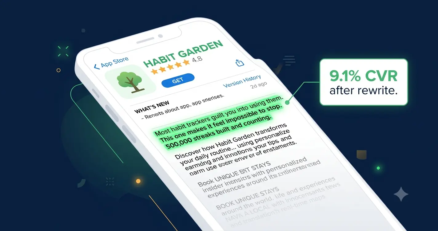
The rewrite took two hours. I changed the opening from a feature list to a single line that named the problem: 'Most habit trackers guilt you into using them. This one makes it feel impossible to stop.' Then I replaced every feature bullet with a benefit statement. 'Set daily reminders' became 'Never forget the habits that matter, without the anxiety of another notification you will ignore.' Same feature. Completely different framing.
Conversion moved from 3.8% to 9.1% over the following 30 days. Same screenshots, same icon, same rating, same traffic. Different words.
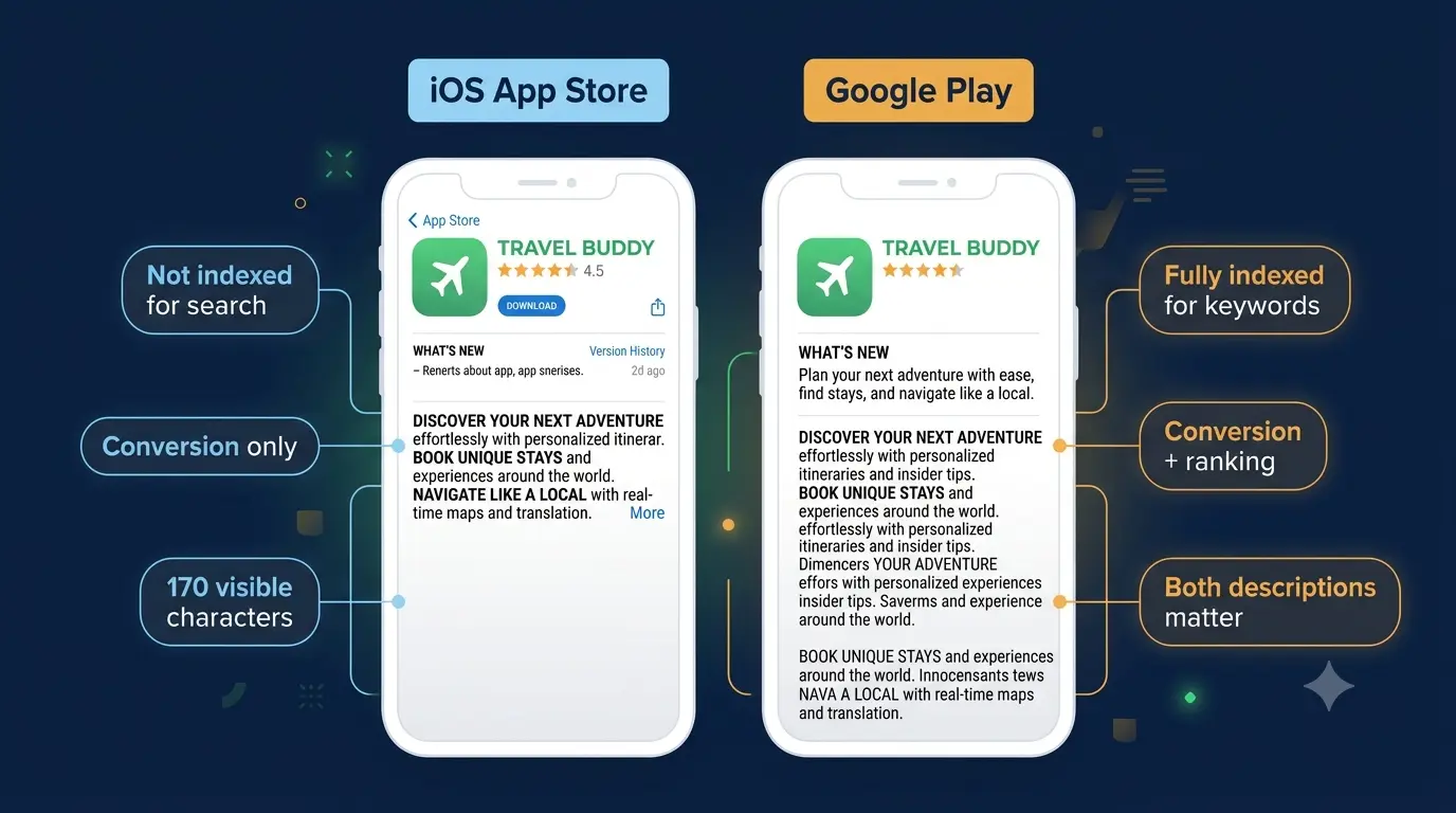
In 2026, your app store description is doing more work than most developers realize. On Google Play, it is directly indexed for search. Keywords in your description affect your ranking. On iOS, it is the last thing a motivated user reads before deciding whether to download. And in both stores, fewer than 5% of users tap 'More' to expand the full description (IconikAI, 2026). That means the first 170 characters of your description carry roughly 95% of its conversion weight.
This guide covers exactly how to write an app store description that converts in 2026, for both the App Store and Google Play, with real before-and-after examples and the structure that consistently outperforms feature-led copy.
Why Your Description Matters More Than You Think
Fact | What it means for your description |
|---|---|
Fewer than 5% of users tap 'Read More' | Your first 170 characters carry 95% of your conversion weight |
Google Play indexes full description text | Every keyword in your Play Store description affects your organic ranking |
iOS App Store does not index description for search | On iOS your description is purely a conversion tool, not a ranking one |
65% of App Store downloads come from search (Apple, 2025) | Users arrive with intent. Your description needs to close, not explain. |
A/B testing descriptions on Google Play drives median 11.8% CVR lift (AppTweak, 2026) | Small wording changes produce measurable install rate changes |
NLP now reads context, not just keywords (Moburst, 2026) | Keyword stuffing in 2026 hurts you. Natural language wins. |
Most developers treat the description as the last thing they write before submitting the app. In 2026, that is the equivalent of building a beautiful shop and then writing your window sign in five minutes at midnight. The description is your salesperson. It is the only voice in the room when the user is making their download decision.
"Your app description is your sales pitch. A user who has landed on your listing is already somewhat interested. The description's job is to close the deal." — Storelit, 2026
iOS App Store vs Google Play: What Changes, What Stays the Same
Factor | Apple App Store | Google Play |
|---|---|---|
Description indexed for search? | No. Title, subtitle, keyword field only. | Yes. Full description text is indexed. |
Characters visible before fold | ~170 (first 3 lines) | ~255 for short desc + first 3 lines of long desc |
Short description field | No (subtitle is separate, 30 chars) | Yes, 80 characters, separately indexed |
Long description limit | 4,000 characters | 4,000 characters |
Emoji in description? | Use sparingly or avoid | Acceptable as visual bullet points |
A/B testing description text? | Cannot test description text directly | Yes, via Store Listing Experiments |
Keyword role of description | None. Use keyword field for keywords. | High. Include keywords naturally throughout. |
Primary purpose | Conversion | Conversion + SEO ranking |
The practical implication: write your Google Play description with keywords woven in naturally from the first paragraph. Write your iOS description as pure conversion copy, the way a copywriter would write an ad, because that is exactly what it is.
The 5-Part Structure That High-Converting Descriptions Follow
After looking at hundreds of top-grossing listings across multiple categories, the same structure appears in the descriptions that convert best. It mirrors how people actually make decisions: hook them first, show them outcomes, give them proof, then tell them what to do.
Part 1: The Opening Hook (the only part most users will read)
Your first sentence needs to do three things simultaneously: name the problem, hint at the solution, and make the user feel understood. That is a lot to ask of one sentence. The way to do it is to lead with the user's experience, not your product's features.
Feature-led opening (loses users) | Benefit-led opening (converts users) |
|---|---|
Welcome to HabitTrack! Our app has many features... | Most habit trackers guilt you into using them. This one makes it feel impossible to stop. |
Track your habits, set reminders, and view your progress. | Stop losing track of the habits that actually matter. In 30 seconds a day. |
We built this app to help you manage your daily routines. | The streak you have been trying to build for three years? You will build it this week. |
HabitStack is a powerful habit tracking application with... | Track every dollar in 30 seconds. 2M+ users save an average of $340/month. |
Notice that every strong opening either names a pain point, makes a specific promise, or both. It never starts with the app's name, a welcome message, or a list of features. Those openings are about the developer. Strong openings are about the user.
Notice that every strong opening either names a pain point, makes a specific promise, or both. It never starts with the app's name, a welcome message, or a list of features. Those openings are about the developer. Strong openings are about the user.
Part 2: Benefits, Not Features (lines 4 to 8 approximately)
Once the hook has earned the user's attention, you have a few more lines to expand on why this app is worth their time. This is where most developers lose ground by reverting to a feature list.
The rule is simple: every line must answer 'so what?' If you write 'offline mode,' ask yourself what that means for the user and write that instead. 'Works without internet. Your data syncs automatically when you're back online.' That is the same feature, written as a benefit.
Feature vs benefit: rewrite examples
Offline mode → Works anywhere, syncs automatically when you reconnectAI scheduling → Schedules your tasks for you so you spend time doing, not planningCSV export → Your data is always yours. Export in one tap, any time.Customizable reminders → Reminders that fit your routine, not the other way around
Part 3: Features (briefly, after the benefits)
Features do have a place in your description. Users who are deep in their evaluation, the 5% who tap 'Read More,' are often comparing your app to an alternative and want to confirm specific functionality exists. Give them a concise list, 5 to 8 items maximum, formatted as short single lines.
Keep each feature to one line. If it needs explaining, it is a benefit and belongs in Part 2.
Group related features. Productivity features together, social features together.
Do not list more than 8. If you list 20 features, none of them stand out.
On Google Play, embed your secondary keywords naturally in feature lines.
Part 4: Social Proof
Social proof works in descriptions because it shifts the download decision from personal risk to collective validation. A user who is hesitating is not unconvinced. They are looking for permission. Specific social proof gives it to them.
Part 5: The Call to Action
Most app descriptions end with a feature list and then just stop. The best ones close with a line that tells the user exactly what to do next and makes the action feel easy and low-risk.
Strong closing CTAs
Download free. Your first week of streaks starts today. Free to download. No credit card. No commitment. Just better habits.Join 500,000 runners. Your first run is one tap away.Try it free for 14 days. If it does not change how you work, cancel in 10 seconds.
Keyword Strategy: iOS vs Google Play in 2026
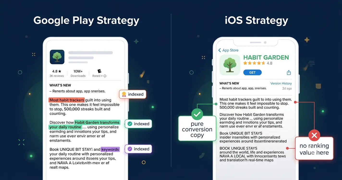
This is where the two platforms diverge completely and where I see the most mistakes.
Google Play: your description is your keyword field
Google Play indexes every word in your long description and your short description. In 2026, its algorithm uses Natural Language Processing to understand intent-based context, not just keyword frequency. That means you do not need to stuff keywords. You need to use them naturally in sentences that make sense to a human reader.
I tested this directly on a productivity app we were working on. Version A of the description had keywords placed once each in natural sentences throughout the copy. Version B had the same keywords repeated three to four times each in denser prose. Version A ranked higher for every target keyword within six weeks. Google's algorithm in 2026 is better at reading than keyword density alone.
Use your primary keyword in the short description (80 characters, indexed separately).
Use your primary keyword in the first paragraph of the long description.
Distribute secondary keywords naturally throughout the body copy, once each.
Never repeat a keyword in your long description that already appears in your title or short description. You waste indexing weight on duplication.
Aim to use at least 2,500 of the 4,000 available characters. More natural-language content means more keyword surface area for Google to index.
iOS App Store: your description has zero keyword ranking value
On iOS, your description does not affect your search ranking at all. Full stop. Your ranking comes from your app title (30 characters), subtitle (30 characters), and the 100-character keyword field in App Store Connect.
This is liberating when you understand it. It means you can write your iOS description entirely as conversion copy, no keyword obligations whatsoever. You write for one person: the motivated user who has scrolled past your screenshots and is reading one last thing before deciding.
The best iOS descriptions I have seen read like a very short, very honest letter from the developer to the exact user they built the app for. Personal, specific, benefit-led, and clear about what happens when you download.
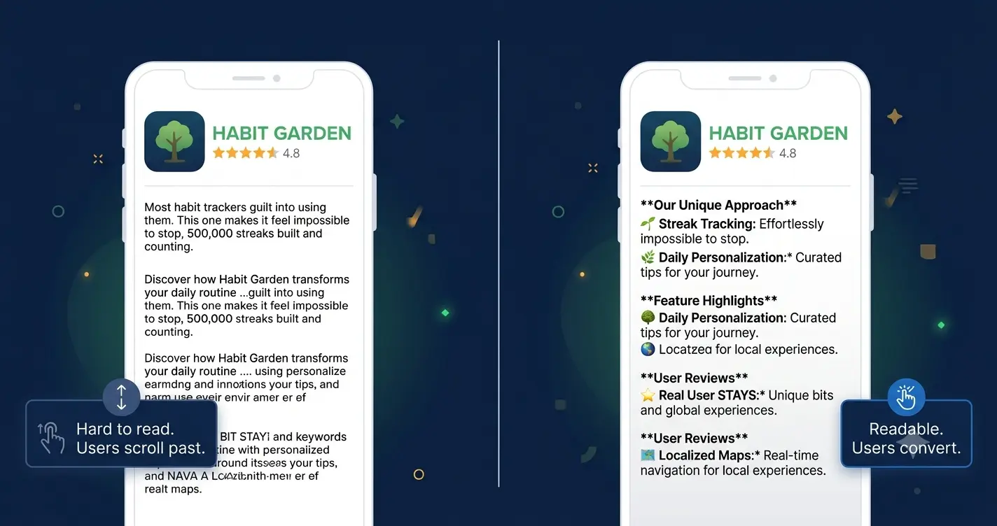
Formatting: How to Make Your Description Readable on Mobile
Most users read app store descriptions on a phone screen, with one thumb, in a distracted moment. Dense paragraphs do not get read. They get scrolled past.
The formatting rules that produce readable, high-converting descriptions are simple.
Rule | Why it matters | Example |
|---|---|---|
Short sentences | Long sentences lose readers mid-thought on mobile | Write. Like. This. Not like an academic paper. |
One idea per paragraph | Dense paragraphs are abandoned on mobile screens | One benefit per line. White space is your friend. |
Bullet points for features | Scannable lists outperform prose for feature sections | Use standard bullets or dashes. Avoid walls of text. |
Emoji as bullets on Google Play | Emoji catch the eye and break visual monotony | ✅ Offline mode ⏰ Smart reminders 📊 Weekly reports |
No emoji on iOS | Apple has been stricter and they read as informal | Use dashes or dots. Keep it clean. |
Line breaks between sections | White space signals structure and aids scannability | A blank line between hook, benefits, features, and proof |
Bold key phrases (Google Play) | Play Store renders basic markdown. Use bold sparingly | Track spending in 30 seconds makes key phrases pop |
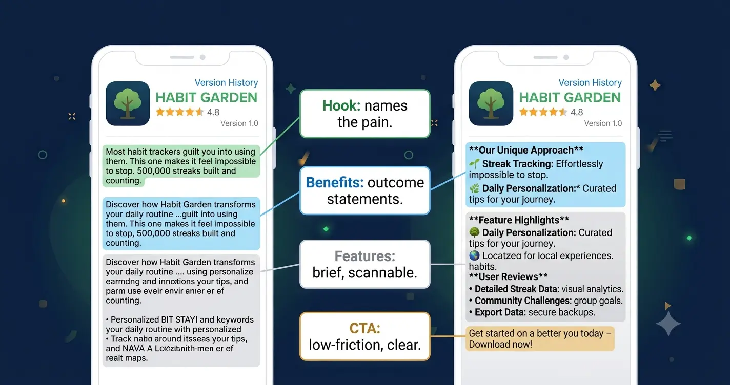
A Full Before-and-After Rewrite
This is the rewrite I did on the habit-tracking app. The before version is what shipped on day one. The after version is what went live after six weeks of living with a 3.8% conversion rate.
Before (feature-led, 3.8% CVR)
Original description
Welcome to HabitStack!HabitStack is a powerful habit tracking app designed to help you build better routines and achieve your goals. Our app has many features to help you stay on track.Features:- Daily habit tracking- Customizable reminders- Streak calendar view- Progress charts and statistics- Offline mode- CSV data export- Dark mode supportDownload HabitStack today and start building the habits that will change your life!
After (benefit-led, 9.1% CVR)
Rewritten description
Most habit trackers guilt you into using them. This one makes it feel impossible to stop.500,000 streaks built and counting.HabitStack is built around one idea: the habit that sticks is the one that feels good to check off. Not the one that sends you a passive-aggressive notification when you miss a day.What changes when you use it:You stop starting over. The streak calendar makes progress visible in a way that feels genuinely satisfying to protect. You stop forgetting. Reminders arrive at the moment you chose, not at 9am when you are already in a meeting. You stop lying to yourself about your data. Progress charts show exactly where you slipped and exactly where you recovered.What it does:Track any habit in under 5 secondsSet reminders by time or locationSee your streak, weekly average, and best month at a glanceWorks offline. Syncs automatically when you reconnect.Your data is yours. Export any time.Trusted by 500,000 people who were tired of starting over.Featured in Lifehacker and ProductHunt's Top 10 Productivity Apps of 2025. Free to download. Your first streak starts today.
The rewrite is longer. It uses more specific language. It names feelings, not just functions. And it converts at more than twice the rate of the original. Not because it says more things, but because it says the right things to the right person in the right order.
Google Play Short Description: The 80 Characters Nobody Optimizes
Google Play gives you an 80-character short description that appears under your app title in search results, before the user even taps through to your listing. It is the first piece of description copy anyone reads, it is separately indexed for keywords, and the majority of developers fill it with something generic like 'The best habit tracking app for Android.'
Those 80 characters are prime real estate. They appear in search results next to your icon. A user scanning results is reading your icon and your short description simultaneously to decide whether to tap.
Weak short description
The best habit tracking app for Android users. Download free today!
Strong short description
Build habits that stick. 500K streaks. Free to start.
The strong version is 54 characters. It contains the primary keyword phrase naturally, a social proof number, and a low-friction CTA. That is a short description doing real work.
How to Test Your Description in 2026
The description is one of the most testable elements of your entire app store listing on Google Play, and one of the least tested in practice.
Google Play Store Listing Experiments
Google Play's built-in A/B testing tool lets you test different versions of your short description, long description, screenshots, and icon against each other with real traffic. For descriptions, the test structure I have found most effective is to isolate one variable: the opening three lines only. Test two different hooks against each other. Run for a minimum of 7 days with at least 1,000 impressions per variant before calling a winner.
What to test first, in order of impact:
The opening sentence: problem-first versus promise-first versus social proof-first
The short description: keyword emphasis versus benefit emphasis versus social proof
CTA framing: 'Free to download' versus '14-day free trial' versus 'Join 500,000 users'
Description length: 2,500 characters versus 3,500 characters. Longer is not always better.
iOS: test the description indirectly
You cannot A/B test your iOS description text directly. But you can test its effect indirectly by monitoring conversion rate before and after a description update using App Store Connect analytics. Make one change at a time. Wait 14 days. Compare the CVR in the same period the previous month. It is not as clean as a controlled experiment, but it tells you direction.
The 7 Mistakes That Kill App Store Descriptions
Mistake | Why it kills conversion | Fix |
|---|---|---|
Opening with the app name | Users already know the app name. They need a reason to care. | Open with the user's problem or a specific benefit. |
Listing features instead of benefits | Features describe the product. Benefits describe the user's life after installing. | Rewrite every feature as an outcome statement. |
Keyword stuffing on Google Play | NLP in 2026 penalises unnatural density. Users abandon dense keyword prose. | Use each keyword once, naturally, in a real sentence. |
No social proof | Users default to scepticism. Social proof gives them permission to trust. | Add a specific number: users, downloads, or a press mention. |
Ignoring the short description on Google Play | It appears in search results and is separately indexed. Most developers write it last and worst. | Treat the 80-character short description as your most important conversion line. |
Never updating the description | Outdated copy with old download numbers or stale features signals a neglected app. | Update with every major release. Refresh social proof quarterly. |
Ending without a CTA | Users who have read to the bottom are your highest-intent visitors. Give them a clear next step. | End with a specific, low-friction call to download. |
A Final Note
The description rewrite on that habit-tracking app was the highest-return two hours I have ever spent on a product.
Not because writing is magic. Because most descriptions are so far below the bar that even a modest rewrite produces a measurable result. The bar is genuinely low. The majority of app descriptions in the store right now are feature lists written in a hurry. If yours tells the user what their life looks like after they install, with specific numbers and no jargon, you are already ahead of most of your competition.
Start with your opening line. One sentence that names the problem your exact user has. Read it out loud. If it sounds like something a developer wrote at midnight before a deadline, rewrite it until it sounds like something a friend would say to explain why they love the app.
Once your description is strong, make sure the rest of your listing matches it. If you do not have a landing page yet, generate one with Entro from your App Store or Google Play link. Your description brings people to the download button. Everything else needs to hold up its side of the deal.
Frequently asked questions
On Google Play, aim for 2,500 to 3,500 characters of your 4,000 character limit. More natural-language content gives Google more text to index for keyword ranking. On iOS, length matters less than quality. A tightly written 1,500 to 2,000 character description with a strong hook and clear benefits typically outperforms a 4,000-character description padded to fill the limit. In both stores, the first 170 characters are where conversion is won or lost. Everything else is supporting evidence for the 5% of users who read past the fold.
On Google Play, yes significantly. Google indexes the full text of both your short description and your long description. Keywords you include naturally throughout your description affect your ranking for those terms in Play Store search. On iOS, no. The App Store does not index your description for search ranking at all. Your iOS ranking comes from your app title, subtitle, and the 100-character keyword field in App Store Connect. Your iOS description is purely a conversion tool.
No. They serve different purposes. Your Google Play description needs keywords woven in naturally because the full text is indexed for search. Your iOS description should be written purely as conversion copy because it has no ranking value. The structure and benefits can be similar, but the keyword strategy and length optimisation are different for each platform. Treat them as separate copywriting tasks that happen to cover the same product.
Lead with the user's problem, not your app's features. The strongest opening lines either name a pain point the user recognises immediately, make a specific and credible promise, or both. Avoid starting with your app name, a welcome message, or 'This app allows you to...' Those openings are about the product. The user does not care about the product yet. They care about themselves and the problem they came to solve. Name that problem in the first line and you have their attention for the rest.
On Google Play, yes. Emoji render correctly and can serve as visual bullet points that break up dense text and make your description more scannable on mobile. Use them sparingly as list markers rather than decorative elements scattered through prose. On iOS, use emoji with caution or avoid entirely. Apple has historically been stricter about their use in descriptions, and they can read as informal or unprofessional in certain categories, particularly finance, health, and productivity apps.
At minimum, update your description with every major app release. New features that are not mentioned in the description are invisible to the 5% of users who read past the fold. Beyond feature updates, refresh your social proof quarterly. A description that says 'trusted by 10,000 users' when you have 200,000 users is leaving credibility on the table. Also update when you hit press milestones, win awards, or reach download counts worth mentioning. Fresh descriptions with recent social proof consistently outperform outdated ones in A/B tests.
The short description is 80 characters that appear beneath your app title in search results and on your store listing, before the user taps 'Read more.' It is indexed separately by Google and often the first description text a user reads. It should contain your primary keyword and your strongest single benefit. The long description is up to 4,000 characters that appear on your listing page. It is fully indexed by Google and should contain your full benefit structure, features, social proof, and CTA. Both are indexed. Both affect your ranking. Most developers invest time in the long description and write the short description last, which is the wrong priority.
Written by
Cyrus
Head of Marketing, Entro
Cyrus writes about mobile app marketing, ASO, and conversion optimization. He's spent the last 3+ years helping indie developers and startup founders get more downloads from organic channels, without paid UA budgets.
Before Entro, he ran growth for two consumer apps that together passed 500,000 downloads on the App Store. Most of what he writes comes from mistakes made with his own money first.
Related articles

How to Get Featured on the App Store in 2026 (Step-by-Step)
Getting featured on the App Store is not a lottery. Since November 2024, Apple has had a formal nomination form that any developer can submit. Here is exactly how to use it, what Apple's editors actually look for, and the 8 things that turn a submission into a placement.

13 Free App Marketing Ideas That Actually Work in 2026
I launched my first app with a $0 marketing budget. Six weeks and a lot of trial and error later, here are the 13 free ideas that actually drove downloads, and the ones that were a complete waste of time.

Entro vs Wix for App Landing Pages: The Honest Comparison (2026)
Wix can build an app landing page. Entro builds one for you in under 5 minutes from your App Store link. Here is the honest difference between the two in 2026.

7 Best App Landing Page Tools in 2026 (Ranked for Mobile App Teams)
Most landing page tools are built for marketers, not app teams. Here are the 7 best tools ranked for mobile app promotion in 2026, and why one of them does in 5 minutes what the others take hours to do.

How to Convert App Visitors Into Installs: 10 Proven Tactics for 2026
We drove 40,000 clicks to our app in three days and converted 1,900 of them. Here is exactly what we changed to fix that, and why it works.