Mobile App Analytics: Which Metrics Actually Matter in 2026
I built a 31-metric analytics dashboard and acted on 2 of them in four months. Here are the 10 metrics that actually predict whether your app grows, retains, and earns, and the ones you can safely stop tracking.

Cyrus

The first analytics dashboard I set up for an app had 31 metrics on it. I built it over a weekend and was genuinely proud of how comprehensive it was. We had install counts by country. Session length by device. Push notification open rates. Screen views per session. Ad impression counts. Daily active users charted against weekly active users charted against monthly active users. All of it updated in real time, all of it visible on a single screen.
We looked at it in our Monday team meeting every week for three months. Then one Monday I asked the team a simple question: which of these 31 numbers have we actually done something because of in the last four weeks?
The answer was two. Day-7 retention, which we had acted on twice. And our onboarding completion rate, which had triggered one sprint. The other 29 metrics had been observed, noted, and forgotten. They were not analytics. They were noise dressed up as data.
This is one of the most consistent patterns I see across app teams in 2026. The tools are better than ever. Firebase, Mixpanel, Amplitude, UXCam all make it trivially easy to track anything. The problem is not access to data. It is knowing which data predicts the outcomes you care about and which data just looks like it does.
Mixpanel's State of Digital Analytics 2026, which analysed 3.7 trillion events across 12,000+ companies, found that the defining macro trend for 2026 is a shift from raw active user counts toward engagement quality and retention depth. Acquisition costs are up. iOS CPI hit $5.84 in Q1 2026. The teams growing sustainably are the ones who know which metrics predict that retained, high-value user, and focus their product decisions on those metrics above all else.
This article covers the 10 metrics that actually matter, why each one predicts something meaningful about your app's health, the 2026 benchmarks to compare yourself against, and the metrics that feel important but consistently mislead.
The Metrics That Lie to You First
Before the 10 that matter, the ones that do not deserve the attention most teams give them.
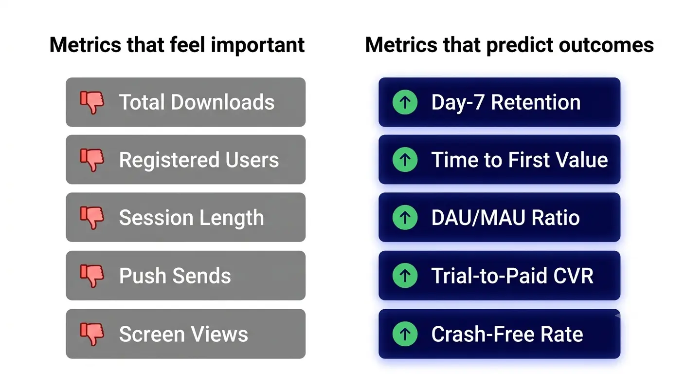
Vanity metric | Why it misleads | What to track instead |
|---|---|---|
Total downloads / installs | Easy to inflate with paid campaigns. Tells you nothing about whether users stayed or found value. | Day-1 and Day-7 retention by install cohort |
Total registered users | Cumulative count grows even as active users decline. A ghost town looks fine on this metric. | Monthly Active Users (with a meaningful definition of 'active') |
Average session length | Long sessions can mean engagement or confusion. A user stuck in an error loop has a long session. | Task completion rate and funnel step conversion |
Total push notification sends | Volume says nothing about whether notifications bring users back or annoy them into uninstalling. | Push notification opt-in rate and re-engagement CVR |
App Store rating (raw number) | Useful as a proxy but easy to game with poorly timed prompts. Absolute number hides trend. | Rating trend over rolling 90 days + review sentiment |
Page views / screen views | Inherited from web analytics. On mobile, screen views without action context is nearly meaningless. | Feature adoption rate and activation event completion |
"Downloads, raw MAU, and registered users are easy to move with a paid push and weakly tied to retention or revenue. Track the metrics that predict whether users come back. — UXCam, Mobile App KPI Guide 2026"
The 10 Mobile App Analytics Metrics That Actually Matter
1. Day-1, Day-7, and Day-30 Retention Rate
If there is one metric that predicts almost everything else about your app's health, it is cohort retention. Not aggregate retention. Cohort retention: the percentage of users from a specific install period who return on Day 1, Day 7, and Day 30.
The reason this metric is so predictive is that it tells you about the product experience independently of acquisition volume. You can grow installs with ads. You cannot fake retention. A user either comes back or they do not.
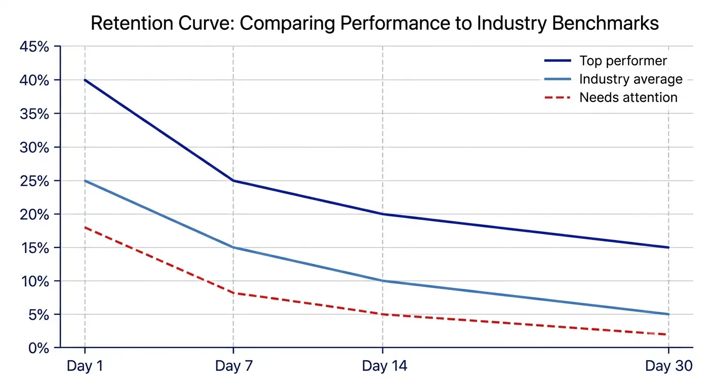
The 2026 benchmarks from UXCam and getstream.io are the most reliable current reference: Day-1 retention averages 25 to 30% across all categories. Day-7 sits at 15 to 18%. Day-30 drops to 5 to 8%. But those are all-category averages, which conceal enormous variation.
Category | Day-1 retention | Day-7 retention | Day-30 retention | Source |
|---|---|---|---|---|
Social apps | 30 to 40% | 20 to 30% | 15 to 20% | UXCam 2026 |
Fintech / banking | 35 to 45% | 25 to 35% | 10 to 15% | UXCam / AppsFlyer 2026 |
Health and fitness | 25 to 35% | 15 to 22% | 8 to 12% | Adjust 2026 |
Productivity / utility | 30 to 40% | 20 to 28% | 10 to 18% | UXCam 2026 |
Gaming (mid-core) | 40 to 50% | 20 to 30% | 8 to 15% | GameAnalytics 2026 |
Gaming (hyper-casual) | 35 to 40% | 12 to 18% | 3 to 8% | GameAnalytics 2026 |
E-commerce | 20 to 30% | 10 to 15% | 3 to 6% | UXCam 2026 |
All-category median | 25% | 10 to 15% | ~5% | Multiple sources 2026 |
The most important insight in that table is the Day-1 number. Across all the apps I have worked on and all the data I have reviewed, Day-1 retention is the single most predictive input for Day-30 retention. A strong Day-7 built on a weak Day-1 is almost always temporary. If users are not coming back after their first session, the diagnosis is almost always in onboarding. Either the time to first value is too long, or the first session does not make a strong enough case for returning.
2. Time to First Value (TTFV)
Time to First Value is the metric that most directly explains your Day-1 retention number. It measures how long it takes a new user to complete the action that demonstrates the app's core promise.
Every app has one action that separates users who understand the value from users who do not. For a habit tracker, it is logging the first habit. For a meditation app, it is completing the first session. For a finance app, it is connecting a bank account. That action is your activation event. Time to First Value is the average time between install and that event.
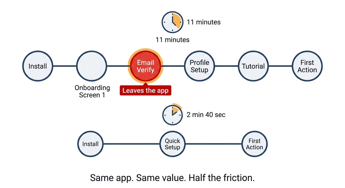
I ran a diagnostic on a productivity app where Day-1 retention was 19%. We mapped every step between app open and the first meaningful action: 7 onboarding screens, an email verification step that required leaving the app, a profile setup with 4 optional fields, and only then the core task creation screen. Time to First Value was averaging 11 minutes. We cut it to 3 mandatory screens, deferred email verification, and made profile setup optional. TTFV dropped to under 3 minutes. Day-1 retention moved to 31% over the following 30 days.
The rule I use: if your TTFV is over 3 minutes, there is onboarding friction between the user and the value your app delivers. Apps that nail first-session activation retain at 2 to 3x the rate of apps that do not, regardless of category (UXCam, 2026). That multiplier applies to Day-7 and Day-30 as well, compounding across the entire retention curve.
3. DAU/MAU Ratio (Stickiness)
The DAU/MAU ratio, often called the stickiness ratio, answers one question: of all the users who were active this month, what percentage came back today?
It is one of the most honest proxies for whether your app has become a habit. An app that users open once a month because they have to, versus an app they open every day because they want to, looks completely different on this metric even if their raw MAU numbers are identical.
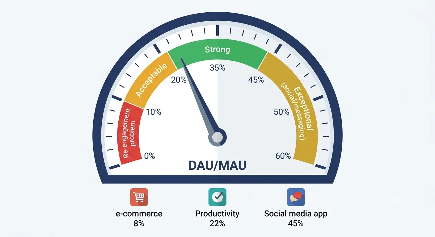
The formula is simple: (Daily Active Users ÷ Monthly Active Users) × 100. A ratio above 20% is considered healthy. Above 25% is strong. WhatsApp and Instagram operate above 50%. Most apps sit between 10% and 20%.
The important nuance: DAU/MAU benchmarks vary enormously by intended use frequency. A daily habit app (fitness tracker, journaling, meditation) should have a much higher ratio than a travel booking app that users open twice a year by design. Benchmark against your category, not the overall average.
The most useful way to use DAU/MAU is as a trend, not as a snapshot. Plot it weekly over 12 weeks. A declining trend is a leading indicator for churn 30 to 60 days later, which gives you enough time to intervene if you are watching for it.
4. Activation Rate
Activation rate is the percentage of new installs who complete your defined activation event within a set timeframe, usually the first session or the first 24 hours.
This metric sits between installs and retention on the growth funnel and it is where many apps lose the most users without realizing it. You can have excellent Day-7 retention among users who activated, but if only 30% of installs ever activate, your overall Day-7 retention number looks weak because you are measuring from installs, not from activations.
Separating activation rate from retention rate is one of the most diagnostically valuable things you can do with your analytics. When I first made this separation on an app we were working on, we discovered that among users who completed our activation event (logging a first habit), Day-7 retention was 41%. Among users who did not, it was 6%. The entire retention problem was an activation problem. Every optimization effort we had been directing at re-engagement campaigns should have been directed at the onboarding flow.
Define your activation event clearly before you start measuring. It should be the single action most correlated with long-term retention in your app.
Track activation rate by cohort and acquisition channel. Users from different sources often activate at very different rates.
A/B test your onboarding to improve activation rate before investing in re-engagement for the users who did not activate.
5. Feature Adoption Rate
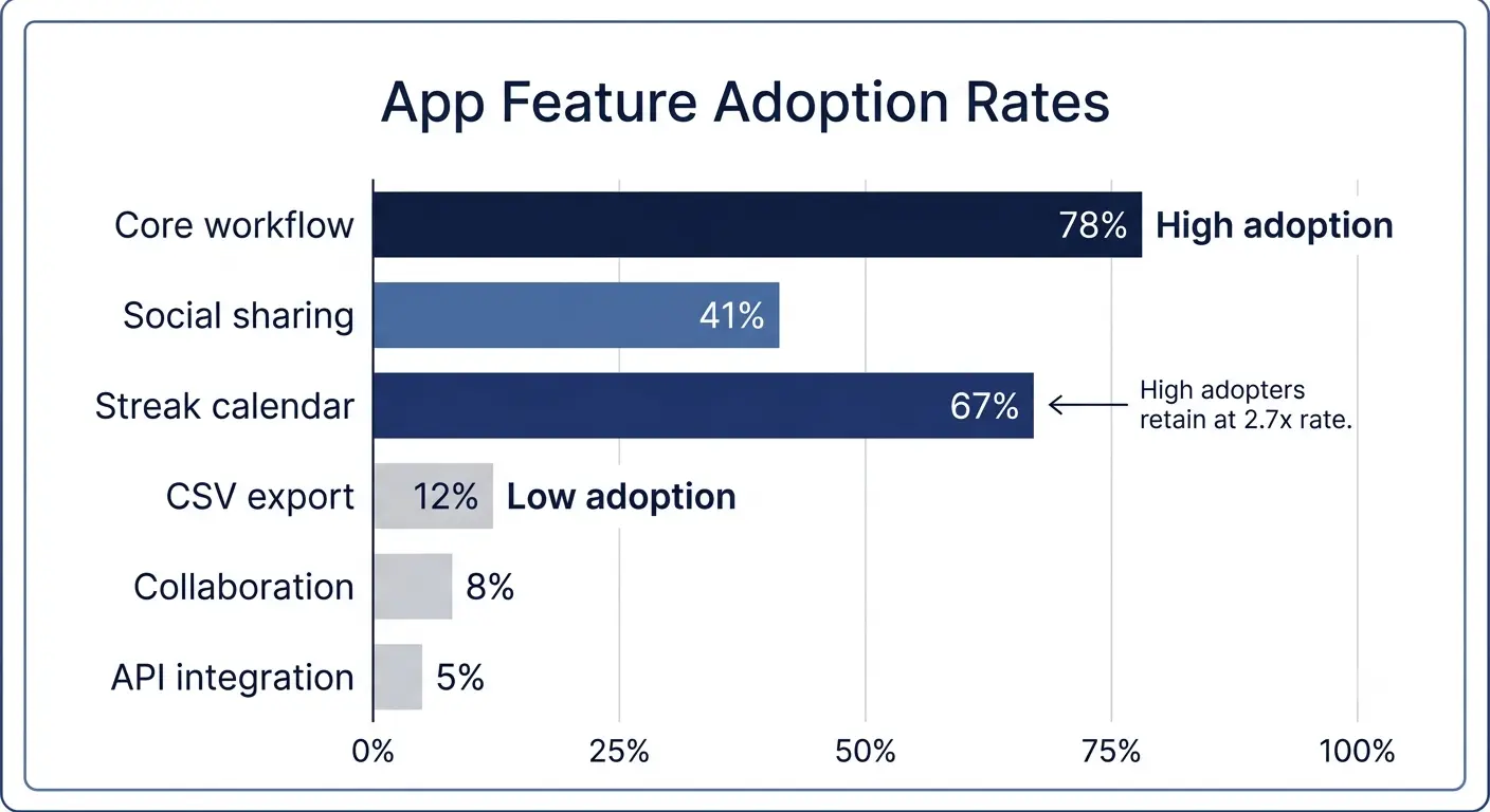
Feature adoption rate measures the percentage of active users who use a specific feature within a defined time period. It tells you whether the capabilities you built are actually being used, and it predicts both retention and upgrade conversion.
Mixpanel's 2026 data introduced a framework they call the feature-to-value ratio: what share of monthly users actually engage with your app's core feature versus peripheral features? High MAU with low core feature adoption is a consistent early indicator of churn. Users have not experienced the value that justifies returning.
I use feature adoption rate as a retention predictor rather than just a product health metric. On the habit tracker, we tracked adoption of the streak calendar feature specifically, because we had a hypothesis that users who engaged with the streak visualization retained at higher rates than those who did not. The data confirmed it: streak calendar users had Day-30 retention of 24%. Non-streak-calendar users had Day-30 retention of 9%. We redesigned the onboarding to surface the streak calendar in session 1. Retention improved across all cohorts in the following month.
6. Churn Rate and Resurrection Rate
Churn rate is the inverse of retention: the percentage of users who stop using your app over a given period. A monthly churn rate above 5% is a warning sign. At 10% monthly churn, you are losing over 70% of your user base every year and fighting to stay flat rather than grow.
But churn rate alone is incomplete. The metric that makes churn rate more useful is resurrection rate: the percentage of previously dormant users (typically defined as no session in 30 or more days) who return in a given period. A healthy resurrection rate tells you your brand has recall value, that users left but did not forget you.
On an app I worked on, our churn rate looked bad on the surface: 8% monthly. But our resurrection rate was 11%, which meant that more users were coming back from dormancy than leaving permanently each month. Net user base was growing despite the churn number. Without the resurrection metric, we would have been optimizing for the wrong problem.
Track churn by segment, not just in aggregate. Churn from paid acquisition users versus organic users versus referral users tells you whether your acquisition channels are bringing quality users.
Define dormancy specifically. 30 days is the standard, but for apps with weekly or monthly use cycles, 60 or 90 days may be more appropriate.
Plot churn rate and resurrection rate on the same chart. The relationship between them tells you more than either metric alone.
7. Trial-to-Paid Conversion Rate (for subscription apps)
If your app has a free trial or freemium model, trial-to-paid conversion rate is your most important revenue metric. It is more predictive than ARPU, more actionable than LTV, and more honest than subscription revenue (which can grow even as conversion rate falls, if you are just acquiring more trial users).
RevenueCat's State of Subscription Apps puts the median trial-to-paid conversion rate at 28 to 32% for productivity apps and 40%+ for health and fitness apps. If you are below those benchmarks for your category, the diagnosis usually sits in one of three places: the trial experience does not deliver enough value before the paywall, the paywall moment is badly timed, or the pricing is wrong for the user's perceived value at that point.
A 5 percentage point improvement in trial-to-paid conversion is often worth more to your revenue than a 20% increase in trial starts, because it compounds. Every future trial user converts at the higher rate. It also improves your LTV without increasing your acquisition cost, which is the most direct lever on unit economics available.
8. LTV to CAC Ratio
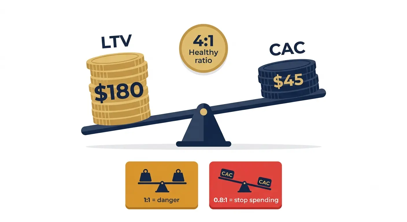
Lifetime Value (LTV) to Customer Acquisition Cost (CAC) ratio is the metric that determines whether your business model is sustainable. If you are spending more to acquire a user than that user generates in revenue over their lifetime with your app, you cannot grow your way out of it. More scale just makes the problem bigger.
In 2026, the standard benchmark is a 3:1 LTV to CAC ratio as a sustainable minimum. Below 2:1, you are burning money on acquisition. Above 5:1, you may be underinvesting in growth relative to the quality of users your app retains.
LTV is harder to calculate than most teams want to admit. The most honest version accounts for average revenue per user, average subscription duration or purchase frequency, and average gross margin. A user who pays $9.99/month and stays for 8 months is not worth $79.92 in LTV if your infrastructure and support costs consume 40% of that revenue.
LTV:CAC ratio | Interpretation | What to do |
|---|---|---|
Below 1:1 | Spending more to acquire users than they generate. Unsustainable at any scale. | Pause paid acquisition. Fix retention and monetization first. |
1:1 to 2:1 | Marginal. Possible at very early stage but not a viable growth model. | Improve trial-to-paid conversion or reduce CAC through organic channels. |
2:1 to 3:1 | Borderline. Workable but leaves no room for inefficiency or market changes. | Optimize conversion and retention before scaling paid spend. |
3:1 to 5:1 | Healthy. Sustainable paid acquisition economics. Room to scale. | Invest in growth. Scale paid channels that are performing. |
Above 5:1 | Strong. Possibly underinvesting in acquisition relative to product value. | Consider increasing marketing spend. Test higher-volume channels. |
9. Crash-Free Rate and Technical Performance
This is the metric that most product teams underweight until it is too late.
In 2026, the App Store's featuring criteria explicitly include app stability. Apple's review team tests apps and a high crash rate is both a rejection risk and a featuring disqualifier. The practical benchmark: 99% crash-free sessions is the industry standard. For fintech and healthcare apps, 99.8%+ is the target because a crash during a financial transaction destroys trust in a way that no amount of marketing can recover.
Beyond crashes, load time is the technical metric most directly tied to conversion. A mobile app that takes over 3 seconds to load its core screen on an average connection is losing users before they have done anything. The install happened. The patience did not.
Track crash-free rate daily and alert at any movement below 99%. A 0.5% drop in crash-free rate can translate to hundreds or thousands of affected users at scale.
Separate crash rate by iOS version, device model, and app version. New device releases often expose device-specific bugs.
Track p95 load time, not average load time. The average hides the worst 5% of experiences, which are often the experiences driving your most frustrated reviews.
10. Net Promoter Score (NPS) by Cohort
NPS divides your users into Promoters (score 9 to 10), Passives (7 to 8), and Detractors (0 to 6) based on the question: how likely are you to recommend this app to a friend or colleague?
Raw NPS is a reasonable signal. NPS by cohort is genuinely useful. When you track NPS separately for users acquired from different channels, who completed different onboarding paths, or who adopted different features, it tells you which version of your product is generating advocates and which is generating detractors.
The most actionable NPS insight I have collected came from segmenting by feature usage. Users who had used the streak calendar feature scored our app NPS of 62. Users who had not scored it 18. The gap was not a product difference. It was a discoverability difference. We surfaced the feature earlier. NPS for new cohorts improved over the following 90 days without changing the feature itself.
Track NPS in-app using a triggered prompt, 14 to 30 days after install for most app types. Earlier and users have not formed a real opinion. Later and you are only measuring the survivors who already like the app.
The 10 Metrics at a Glance: Your 2026 Reference
Metric | What it measures | 2026 benchmark (all categories) | Review cadence |
|---|---|---|---|
Day-1 Retention | % of installs who return after 24 hours | 25 to 30% | Weekly by cohort |
Day-7 Retention | % of installs who return after 7 days | 15 to 18% | Weekly by cohort |
Day-30 Retention | % of installs who return after 30 days | 5 to 8% | Monthly by cohort |
Time to First Value | Minutes from install to activation event | Under 3 minutes is target | Weekly trend |
DAU/MAU Ratio | Daily actives as % of monthly actives | 20%+ healthy, 25%+ strong | Weekly trend |
Activation Rate | % of installs who complete activation event | Category-dependent | Weekly by channel |
Feature Adoption Rate | % of MAU who use a specific feature | Track by feature, flag below 20% | Monthly |
Churn + Resurrection Rate | Users lost vs dormant users recovered | Monthly churn under 5% | Monthly |
Trial-to-Paid CVR | % of trial users who convert to paid | 28 to 32% (productivity), 40%+ (fitness) | Weekly |
LTV:CAC Ratio | Revenue per user vs cost to acquire | 3:1 minimum sustainable | Monthly |
Crash-Free Rate | % of sessions without a crash | 99%+ (99.8%+ for fintech) | Daily alert |
NPS by Cohort | Promoter vs detractor ratio by segment | Industry varies; trend matters more | Quarterly |
How to Structure Your Analytics Review Cadence
Knowing which metrics matter is only useful if you have a rhythm for reviewing them. The mistake most teams make is either reviewing everything daily (too much noise) or reviewing nothing until a problem is obvious (too slow).
Daily (automated alerts): Crash-free rate, any metric that falls below a threshold you set. Not manual review. Automated alert.Weekly (15-minute team review): Day-1 and Day-7 retention by most recent cohort, DAU/MAU trend, activation rate, trial-to-paid conversion rate this week vs last week.Monthly (60-minute deeper session): Day-30 retention by cohort and channel, LTV:CAC by channel, feature adoption report, churn vs resurrection, NPS by segment.Quarterly (strategic review): Full cohort analysis across 12 months, NPS trend, LTV model update, category benchmark comparison.
Stage-Based Priority: Which Metrics to Focus on When
Stage | Primary focus | Metrics to prioritize | Metrics to deprioritize |
|---|---|---|---|
Pre-launch / 0 to 1K users | Product-market fit signals | TTFV, Day-1 retention, activation rate, qualitative NPS | LTV:CAC (too little data), DAU/MAU (too few users) |
Early growth / 1K to 10K MAU | Retention and activation | Day-7 and Day-30 retention, activation rate, DAU/MAU trend, feature adoption | Revenue metrics (premature), crash-free rate (should be stable) |
Growth / 10K to 100K MAU | Monetization and efficiency | Trial-to-paid CVR, LTV:CAC, churn by channel, resurrection rate | Raw installs (focus on quality), average session length |
Scale / 100K+ MAU | Defending retention + unit economics | Cohort retention by segment, ARPPU, NPS by cohort, churn by segment, p95 latency | Total MAU (too aggregated), vanity counts |
A Final Note
We ended up with 8 metrics on our Monday dashboard. Down from 31.
The 8 we kept were Day-1 retention, Day-7 retention, activation rate, DAU/MAU ratio, trial-to-paid conversion, crash-free rate, LTV by acquisition channel, and our feature adoption rate for the streak calendar specifically. Every metric we removed either told us something we already knew from the ones we kept, or told us something we could not act on.
The team meeting changed. Instead of 20 minutes of people reporting numbers at each other, it became 15 minutes of people asking questions: Day-7 is up this week, which cohort, what changed? Activation rate is down on the Android build, is there a specific device or OS version? Trial conversion on the health category ads is lower than fitness ads, should we test different paywall timing for that segment?
That is what mobile app analytics is supposed to do. Not give you a beautiful dashboard. Give you the right questions to ask about a small number of things that actually determine whether your app grows or stalls.
Start with Day-7 retention and Time to First Value. Get those two right for your specific category and the rest of the metrics in this article become the tools you use to understand why they are moving.
And if you want users to start flowing in before your analytics can tell you anything useful, make sure you have a landing page they can find and convert on. Generate one with Entro from your App Store or Google Play link and have a professional, conversion-ready page live in under 5 minutes.
Frequently asked questions
Mobile app analytics is the collection, measurement, and interpretation of data about how users interact with a mobile application. It covers acquisition metrics (installs, cost per install), engagement metrics (DAU, session frequency), retention metrics (Day-1, Day-7, Day-30 cohort retention), revenue metrics (ARPU, LTV, trial-to-paid conversion), and technical metrics (crash-free rate, load time). The goal is not to collect as many metrics as possible but to identify the small set of metrics that predict whether your app is delivering value to users and generating sustainable revenue.
Day-7 retention by install cohort is the single metric most consistently predictive of an app's long-term health across categories. It captures whether users found enough value in the first week to return, which is the critical test for product-market fit. It is also upstream of every revenue metric: users who do not retain at Day-7 rarely convert to paid, rarely generate meaningful LTV, and rarely refer others. If you could only track one metric, Day-7 cohort retention is the one. Time to First Value is a close second because it directly explains the Day-1 retention that feeds the Day-7 number.
A DAU/MAU ratio above 20% is generally considered healthy, indicating that roughly one in five monthly users also opened the app today. Above 25% is strong. Messaging and social apps like WhatsApp and Instagram operate above 50% because daily engagement is the entire product model. The more important thing than the absolute number is the trend: a DAU/MAU ratio that declines week over week for 4 consecutive weeks is a leading indicator of churn 30 to 60 days later, giving you time to intervene before it shows up in your monthly retention numbers.
Time to First Value (TTFV) is the average time between a user's first app open and their completion of the core activation event, the specific action that demonstrates the app's primary value. For a fitness app it might be completing the first workout. For a note-taking app it might be creating and saving a first note. For a finance app it might be linking a bank account. TTFV matters because it is the strongest predictor of Day-1 retention. Apps that deliver their core value in under 3 minutes retain users at 2 to 3x the rate of apps where finding value takes 10 or more minutes. Every onboarding screen, verification step, or optional setup form that sits between install and value costs you a measurable percentage of users.
For subscription apps, LTV is approximately: Average Monthly Revenue Per Subscriber multiplied by Average Subscription Duration in months, multiplied by your gross margin percentage. For example, a $9.99/month app with 60% gross margin and an average subscriber duration of 10 months has an LTV of roughly $59.94. The challenge is that subscription duration is only knowable retrospectively, so most teams model it based on early cohort data and renewal rates. RevenueCat's benchmarks are the best reference for subscription LTV by category in 2026. The ratio that matters most is LTV:CAC, which should be at least 3:1 for paid acquisition to be sustainable.
Vanity metrics are measurements that look good in a presentation but do not predict retention, revenue, or sustainable growth. Total download count is the most common example: it is easy to inflate with paid campaigns and tells you nothing about whether those users stayed. Other vanity metrics include total registered users (a cumulative number that keeps growing even as active users decline), average session length (long sessions can mean engagement or confusion), total push notification sends (volume is meaningless without conversion data), and raw screen views (inherited from web analytics and rarely actionable on mobile). The test for any metric is simple: does this number changing cause you to change your product or strategy? If not, it is probably a vanity metric.
The right cadence depends on the metric. Crash-free rate should be monitored daily with automated alerts set to trigger below 99%. Core growth metrics like Day-7 retention, activation rate, and trial-to-paid conversion should be reviewed weekly in a team meeting, comparing this week to last week and to the same period a month ago. Revenue and LTV metrics should be reviewed monthly. Strategic metrics like full cohort analysis, NPS trends, and LTV model updates are quarterly work. Daily dashboard staring is a trap. It generates anxiety about noise and conditions teams to react to fluctuations that would self-correct if given a week to settle.
Written by
Cyrus
Head of Marketing, Entro
Cyrus writes about mobile app marketing, ASO, and conversion optimization. He's spent the last 3+ years helping indie developers and startup founders get more downloads from organic channels, without paid UA budgets.
Before Entro, he ran growth for two consumer apps that together passed 500,000 downloads on the App Store. Most of what he writes comes from mistakes made with his own money first.
Related articles