High-Converting Website Layout: The Section-by-Section Blueprint for 2026
A high-converting website layout is built around one clear action and orders nine sections the way people decide: hero, social proof, problem and promise, services, how it works, proof, FAQ, contact and a final call to action.

Cyrus
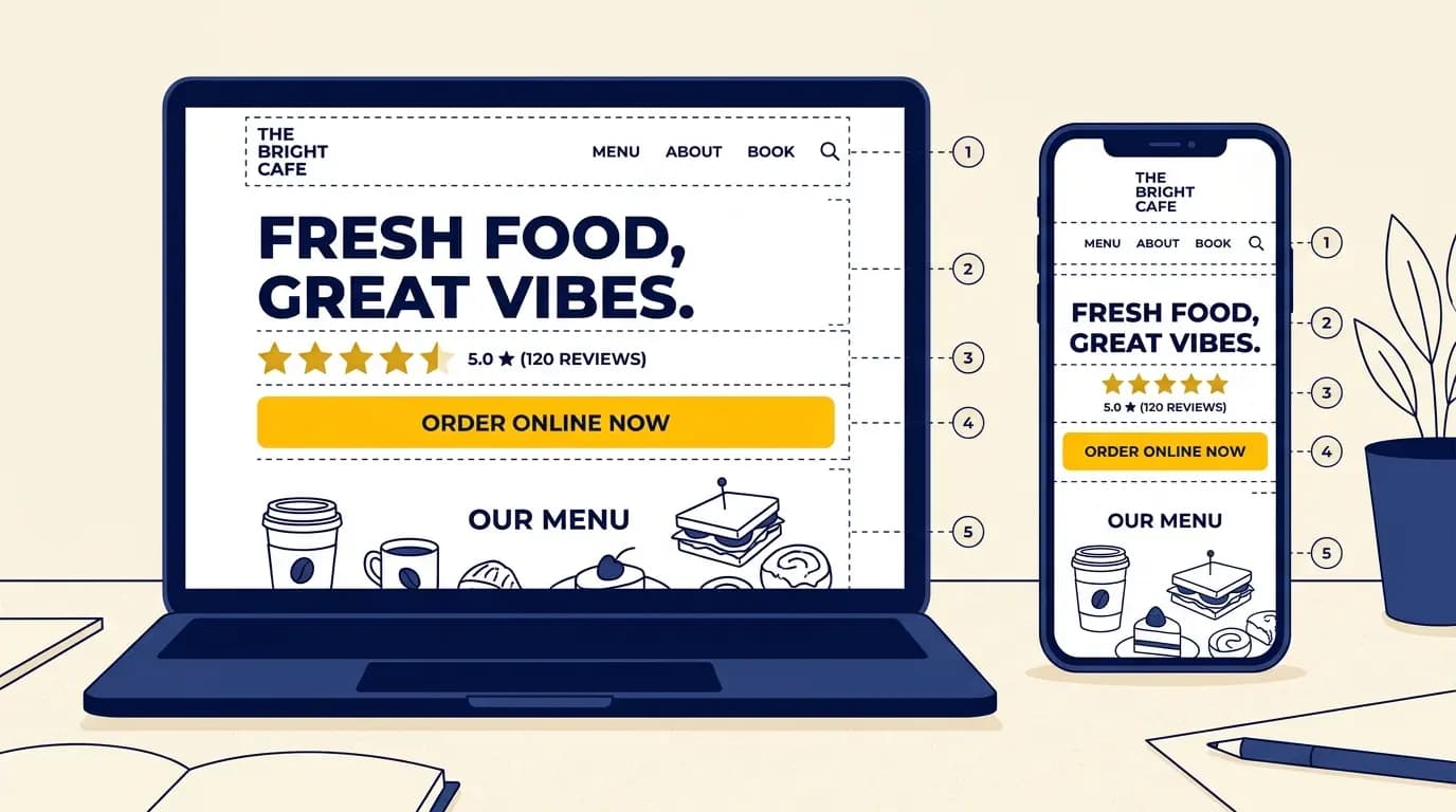
A high-converting website layout is built around one clear action and stacks nine sections in the order people decide: a hero that says what you offer, a social proof bar, the problem and promise, services as benefits, how it works, proof, objections and FAQ, location and contact, and a final call to action. Get that order and the hero right, and most of the gain is yours.
Two websites can sell the same service, to the same town, and get completely different results.
One turns visitors into calls and bookings. The other gets visits and nothing else. The difference is rarely the colours or the font. It is the layout.Layout is the order of your sections, what sits on the first screen, and how obvious the next step is. In this guide we walk through a high-converting website layout section by section, explain why each section is there, and show the mistakes that quietly cost small businesses customers.
This is written for business owners, not designers: cafes, salons, clinics, trades, shops and freelancers who want their website to bring in calls and bookings.
What is a high-converting website layout?
A high-converting website layout is a page structure that guides visitors toward one main action, such as booking, calling or buying, with as little friction as possible. It places the offer, the proof and the call to action in the order people make decisions, so more visitors act instead of leaving.
Does layout really change results? Yes. The same offer, shown to the same visitors, converts differently depending on what they see first, how quickly they find proof, and whether the next step is obvious. Colours and fonts matter far less than structure and clarity.
"High-converting" is relative. According to Unbounce's 2024 Conversion Benchmark Report, which analysed more than 41,000 landing pages, the median conversion rate across industries is 6.6%. If your page converts well below that, the layout is usually the first place to look.
The rules every converting layout follows
The short version
- One page, one primary action. Every section points to the same button.
- The first screen answers three questions: what is this, why should I care, what do I do next.
- Proof comes right after the promise, not at the bottom.
- Repeat the same call to action down the page.
- Design for the phone first. Most visitors are on one.
- Keep it fast. A slow page loses people before the layout matters.
- Remove friction: fewer fields, fewer choices, fewer steps.
The section-by-section blueprint
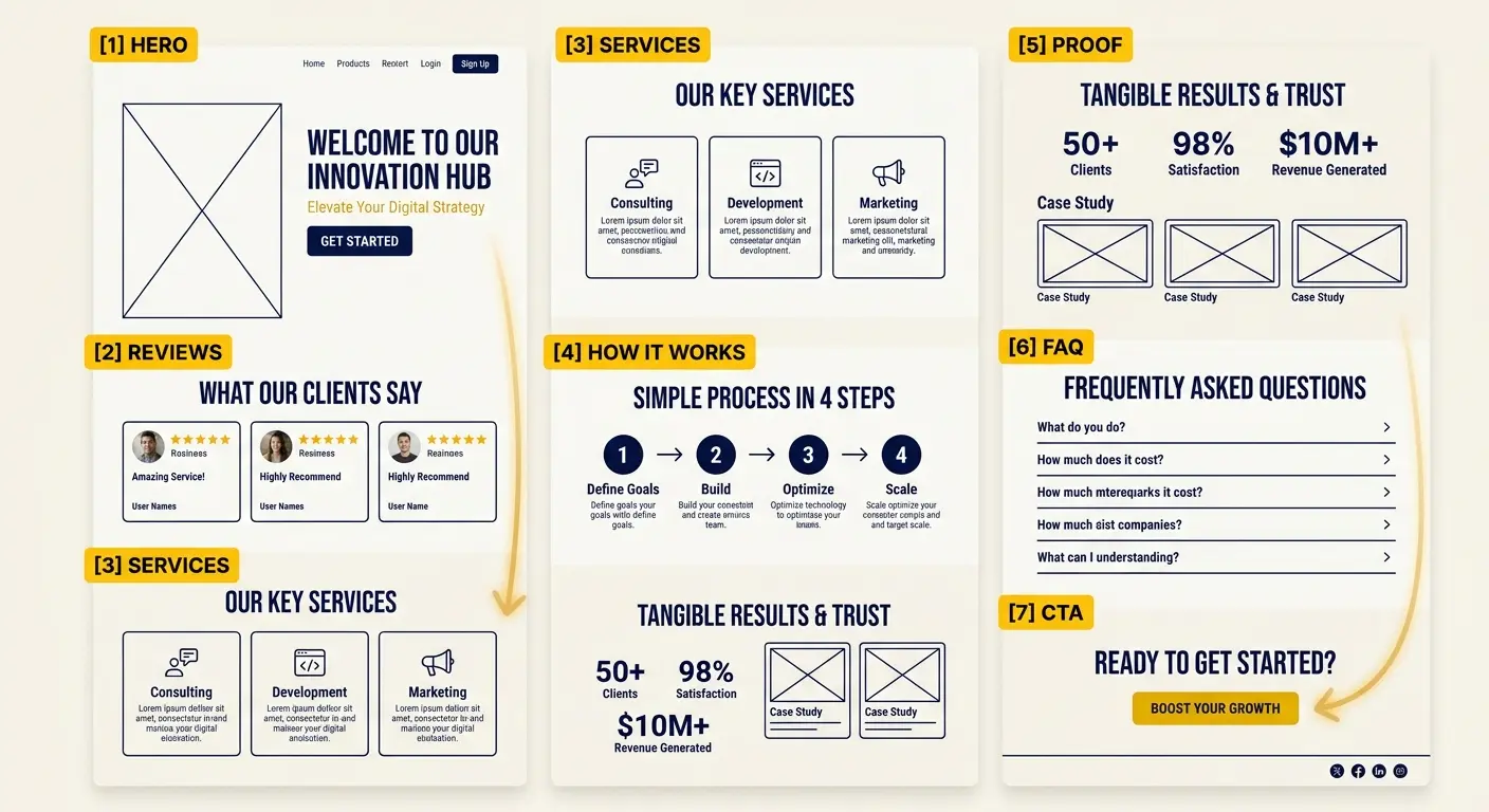
Here is the order we recommend for most small business homepages and landing pages. Each section has one job. You will not always need all nine, but the sequence mirrors how a visitor decides: understand, trust, picture it, believe it, act.
Section | Its one job | What to include |
|---|---|---|
1. Hero | Explain what you offer and what to do next in five seconds | Outcome headline, one-line subhead, one primary button, a real photo, one trust cue |
2. Social proof bar | Borrow trust immediately | Star rating, review count, "trusted by" logos or a short quote |
3. Problem and promise | Show you understand the visitor | The problem in their words and the outcome you deliver |
4. Services or offer | Show what they can buy | Your main services as benefits, with a short line each |
5. How it works | Remove the "is this hard?" doubt | Three simple steps ending in the result |
6. Proof | Make the promise believable | Reviews, before and after photos, numbers, short stories |
7. Objections and FAQ | Answer the reason they would not act | Price, timing, guarantees, what happens next |
8. Location, hours and contact | Make it easy to show up or get in touch | Address, map, hours, phone, booking link |
9. Final call to action | Catch the visitor who scrolled to the end | The same primary button with one confident line |
In short: promise, proof, ask, then repeat the ask.
1. The hero section
The hero is the first screen a visitor sees before scrolling, and it does most of the work. Lead with the outcome in plain words, add one line of detail, and give one obvious button. "Same-day boiler repair in Leeds, booked in two minutes" beats "Your comfort is our passion" every time.
2. The social proof bar
Social proof is evidence that other people already trust you. Directly under the hero, show your star rating, your number of reviews, or a short line such as "Rated 4.9 by 320 local customers". According to BrightLocal's 2025 Local Consumer Review Survey, only 4% of consumers say they never read online reviews, so proof this early reassures almost everyone who lands on the page.
3. Problem and promise
Name the problem the way your customer would say it, then show the better outcome. Two or three sentences is enough. This is where visitors decide you understand them.
4. Services as benefits
List what you offer, but frame each item around what the customer gets. "Deep tissue massage" is a feature. "Walk out without the back pain you came in with" is a benefit. Pair them.
5. How it works
Three steps, one line each: book online, get a confirmation within the hour, show up. Three is enough to show the path and short enough to read at a glance. This removes the fear that working with you will be complicated.
6. Proof
Put your strongest reviews, before and after photos, or real numbers here. Specific beats generic: "Fixed our leak in 40 minutes, on a Sunday" is far more persuasive than "Great service".
7. Objections and FAQ
Every visitor has a reason not to act: price, timing, trust, effort. Answer the top three or four directly. A short FAQ, a clear guarantee or a "no card needed" line can be the difference between a bounce and a booking.
8. Location, hours and contact
For a local business this section is not optional. Show your address with a map, your opening hours, a tap-to-call phone number and your booking link, and keep them identical to your Google Business Profile so customers and search engines see the same details. It is also near the top of the list of what every small shop website needs. A visitor ready to come in should never have to hunt for it.
9. The final call to action
Close with the same primary button you used in the hero, with one short line. Someone who scrolled all the way down is often the most ready to act.
Above the fold: the five-second test
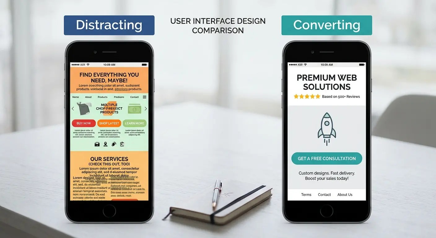
"Above the fold" means everything visible before a visitor scrolls. It matters more than any other part of the page. According to Nielsen Norman Group's 2018 eye-tracking study on scrolling and attention, people spend about 57% of their page-viewing time on the first screenful and 74% on the first two. If the top of your page fails, most of what is below it never gets read.
That is why visual hierarchy matters so much here: the most important thing (your headline and button) should be the biggest and most obvious thing on the screen, and everything else should step back.
The five-second test
Open your homepage on your phone, count to five, then look away. Could a stranger answer three questions in that time: what is this, what is in it for me, and what do I do next? If not, fix the hero before you touch anything else.
Where to put your call to action
A call to action (CTA) is the button or link that asks the visitor to take your main step. Place your primary call to action in three spots: in the hero, right after your proof section, and at the very end. Use the same wording each time, so visitors never wonder whether the buttons do different things.
Make the button text describe the result: "Book your table", "Get a free quote", "Call now". Avoid "Submit" and "Learn more". On a phone, a sticky button at the bottom of the screen keeps the action within thumb reach the whole way down.
Design mobile-first, and keep it fast
According to Statcounter data published by Statista, mobile phones accounted for 62.5% of global website traffic in the second quarter of 2025. Design the phone layout first: one column, a headline that fits without zooming, buttons big enough for a thumb, and a click-to-call number. Then let the desktop version expand from there.
Speed belongs here too. According to Google's 2017 mobile speed research, 53% of mobile visits are abandoned when a page takes longer than three seconds to load. Akamai's 2017 State of Online Retail Performance report found that a 100 millisecond delay can cut conversion rates by 7%. Those studies are a few years old, but the lesson has not changed. Compress your images, avoid autoplay video and test on a real phone, not just your laptop.
Homepage layout vs landing page layout
The blueprint works for both, but the two pages have different jobs. Unlike a homepage, which introduces your whole business to every kind of visitor, a landing page is built for one offer and one audience, usually traffic from an ad or an email. That is why landing pages often convert better: there is nothing else to click.
Feature | Homepage | Landing page |
|---|---|---|
Main job | Introduce the business and route visitors | Get one specific action from one audience |
Navigation | Full menu | Little or none |
Calls to action | One primary, a few secondary links | One, repeated |
Typical traffic | Google search, Maps, word of mouth | Ads, emails, social posts |
Sections | Most of the nine | Hero, proof, offer, FAQ, call to action |
If you are just starting, build a strong homepage first. Add landing pages later for specific offers or ad campaigns.
One page or several pages?
Many small businesses do well with a single long page that follows the blueprint from top to bottom. It keeps visitors on one path to one button. It starts to strain when you have many services, each worth explaining on its own.
One-page layout: pros
- One clear path from headline to call to action
- Works naturally on a phone: visitors just keep scrolling
- Quick to build and easy to keep up to date
One-page layout: cons
- Harder to rank for many different services from one page
- Gets long and crowded if you offer more than a few services
- No room for detailed pages like a full menu or price list
A good rule: start with one strong page, and give a service its own page once you have enough to say about it, or once people search for it by name.
The best small business website layout, by industry
The order of sections stays roughly the same, but what you put first changes with what your customers want to do.
Business | Primary action | Lead with | Must-have section |
|---|---|---|---|
Restaurant or cafe | Book a table or order | Food photos and opening hours | A menu that reads well on a phone |
Salon or barber | Book an appointment | Your work and a booking button | Price list and online booking |
Trades (plumber, electrician) | Call or request a quote | Service area and tap-to-call | Reviews that mention speed and reliability |
Clinic or therapist | Book a consultation | Reassurance and credentials | A clear FAQ on cost and the first visit |
Local shop | Visit the store | What you sell and where you are | Map, hours and parking details |
Common high-converting layout mistakes
Most small business pages that underperform make the same handful of mistakes. The good news: each one is fixable without a redesign.
Mistake | Why it costs you | The fix |
|---|---|---|
Several competing buttons | Visitors cannot tell what to do, so they do nothing | Pick one primary action and make the rest secondary links |
A clever headline that says nothing | Visitors cannot tell what you offer in five seconds | Lead with the outcome in plain words |
Hiding the call to action | A ready visitor has to hunt for how to act | Put it in the hero and repeat it down the page |
Features without benefits | People buy outcomes, not features | Pair each feature with what it does for them |
No proof, or proof at the bottom | Claims without evidence are not believed | Show your rating under the hero and reviews mid-page |
Long forms | Every extra field is a reason to quit | Ask only for what you need to reply |
A slow, heavy page | Visitors leave before it loads | Compress images, cut scripts, test on a phone |
How to test and improve your layout
A converting layout is rarely perfect on day one. The best ones improve through small, deliberate changes.
Start with the hero
It is the highest-leverage part of the page. Get the headline, subhead and button right first.
Change one thing at a time
Test a single element, such as the headline or the button text, so you know what moved the result.
Watch what visitors actually do
Free tools like Google Analytics and Microsoft Clarity show where people click, scroll and stop.
Give it enough time
Small sites need a few weeks of traffic before a change shows a real difference.
Keep the winners
Keep what lifts bookings or calls, and remove sections that distract from the main action.
The shortcut for local businesses
If your business is on Google Maps, Entro builds this layout for you in about a minute: your details fill the hero, your Google reviews become the proof section, and your hours and location are already in place. Every section is editable with AI in plain language, so testing a new headline or moving a button takes seconds.
If you want the full walkthrough, see how to create a website from a Google Maps link. And if you would rather start from a blank page, our guide to building a website with no coding skills covers the process step by step.
To be fair about where Entro fits: it is built for local and small business sites. If you run a store with hundreds of products or a multi-step sales funnel, a dedicated ecommerce or funnel platform will serve you better, and our roundup of the best website builders for small business compares the options honestly. For formal split tests with traffic divided between two versions, pair whichever builder you use with a dedicated testing tool.
Get started
Get a layout built to convert
Paste your Google Maps link into Entro and get a complete website with a clear hero, real reviews and a strong call to action already in place. Edit any section with AI. Free to start.
You see the finished site before you pay anything, and our pricing page shows exactly what publishing costs.
Final thought
A high-converting website layout is an act of focus, not decoration. Decide the one thing you want visitors to do, put it where they cannot miss it, back it with proof, and clear away anything that competes with it. Get the hero and the call to action right first, then improve one change at a time. The prettiest site rarely wins. The clearest one does.
Updated October 2026.
Frequently asked questions
A high-converting website layout is a page structure that guides visitors toward one main action, such as booking, calling or buying, with as little friction as possible. It puts a clear hero first, then social proof, your offer as benefits, more proof, answers to common objections and a repeated call to action, in the order people make decisions.
Above the fold, before anyone scrolls, a visitor should see an outcome-focused headline in plain words, a one-line subhead, one primary call-to-action button, a real photo and one trust cue such as your star rating. Nielsen Norman Group's 2018 research found people spend about 57% of their viewing time on the first screenful, so this area does most of the work.
One primary call to action, repeated. Put the same button in the hero, after your proof section and at the end of the page, with the same wording each time. Offering two or three equally weighted actions is one of the most common conversion mistakes, because when visitors cannot tell what to do, most do nothing.
Yes. The same offer shown to the same visitors converts differently depending on what appears first, how quickly proof appears and how obvious the next step is. Layout also shapes speed and mobile usability. Google's 2017 research found 53% of mobile visits are abandoned when a page takes longer than three seconds to load.
According to Unbounce's 2024 Conversion Benchmark Report, which analysed more than 41,000 landing pages, the median conversion rate across industries is 6.6%. Rates vary a lot by industry and by traffic source, so the most useful benchmark is your own page over time: change one thing, measure it, and keep what improves bookings or calls.
For most small businesses, the best layout leads with a hero that says what you do and where, one clear action (book, call or visit), then your Google reviews as proof, your services framed as benefits, a short FAQ, your hours and location with a map, and the same call to action again at the end. It must load fast and work well on a phone.
Start with one strong page if you offer a few services: it keeps visitors on a single path to one button and works naturally on a phone. Move to multiple pages once a service deserves its own explanation, needs a full menu or price list, or once people search for it by name, since separate pages are easier to rank.
Put reviews in two places. Show a short proof line, such as your star rating and review count, directly under the hero so visitors trust you straight away. Then add a fuller proof section mid-page with your most specific reviews, before and after photos or real numbers. BrightLocal's 2025 survey found only 4% of consumers never read online reviews.
A homepage introduces your whole business to every kind of visitor, with a full menu and one primary action plus a few secondary links. A landing page is built for one offer and one audience, usually traffic from an ad or email, with little or no navigation and a single repeated call to action. That focus is why landing pages often convert better.
Written by
Cyrus
Head of Marketing, Entro
Cyrus writes about mobile app marketing, ASO, and conversion optimization. He's spent the last 3+ years helping indie developers and startup founders get more downloads from organic channels, without paid UA budgets.
Before Entro, he ran growth for two consumer apps that together passed 500,000 downloads on the App Store. Most of what he writes comes from mistakes made with his own money first.
Related articles